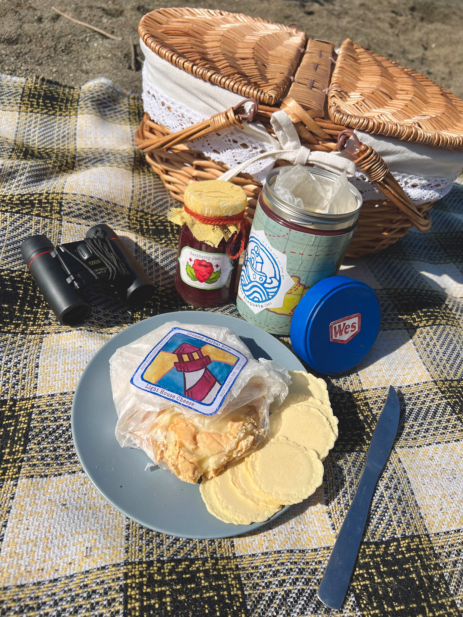
For this project I chose a movie and designed a product line that would exist in that universe. Throughout this process my goal was to create original and exciting branding and logos. Then test my designs on increasingly accurate prototypes. I had two months to create this and by the end I wanted to have high quality products that looked like they were right out of my universe of choice.
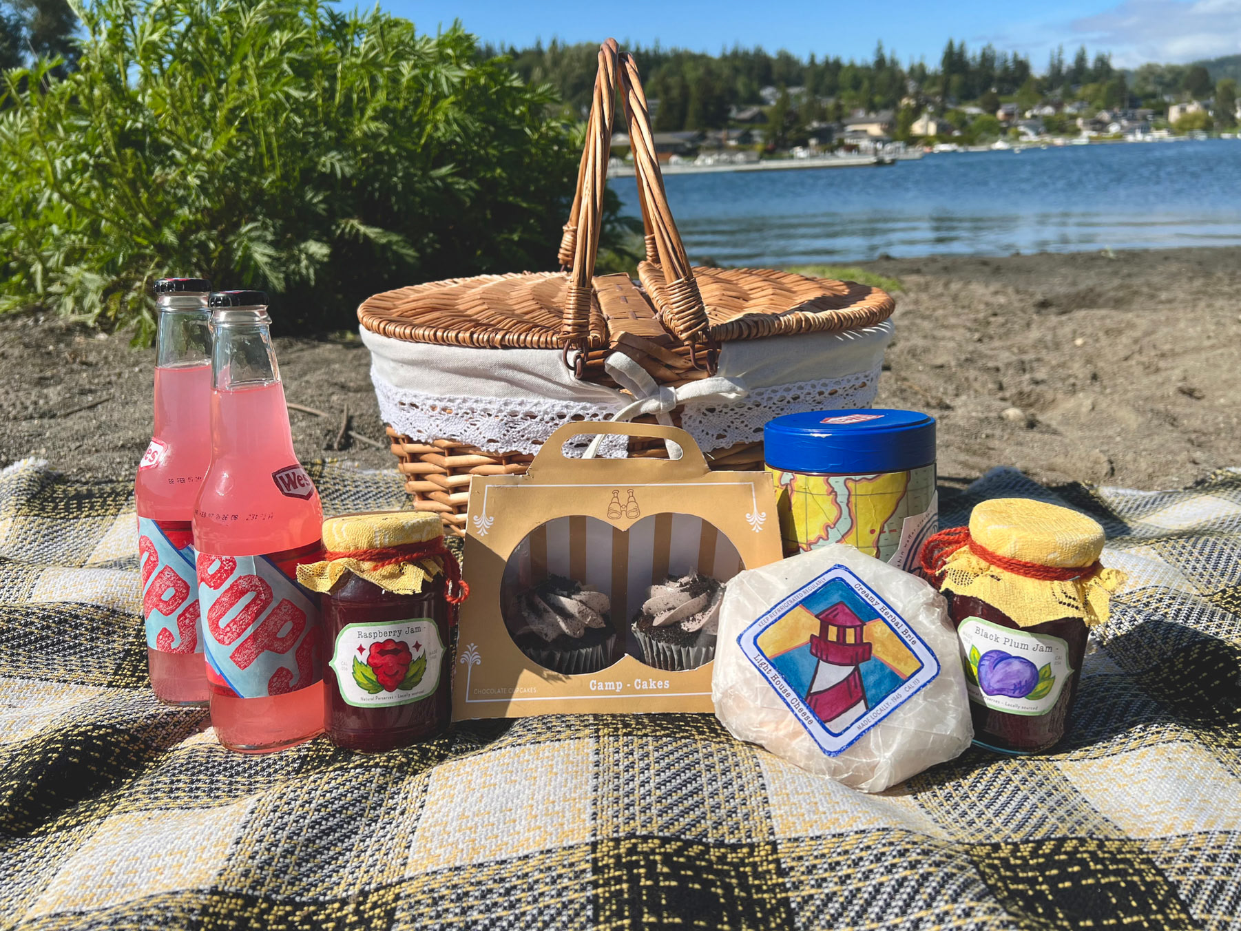
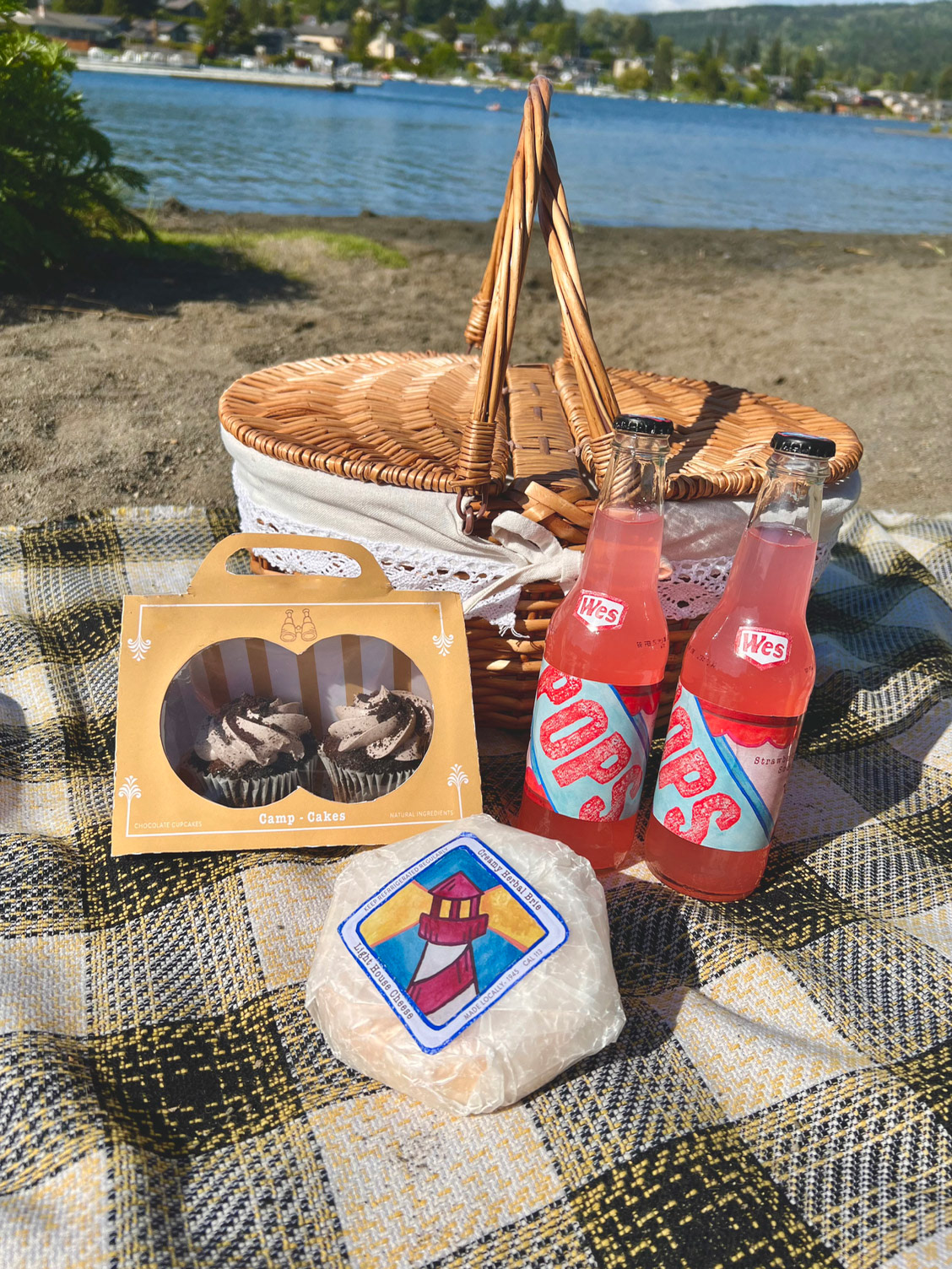
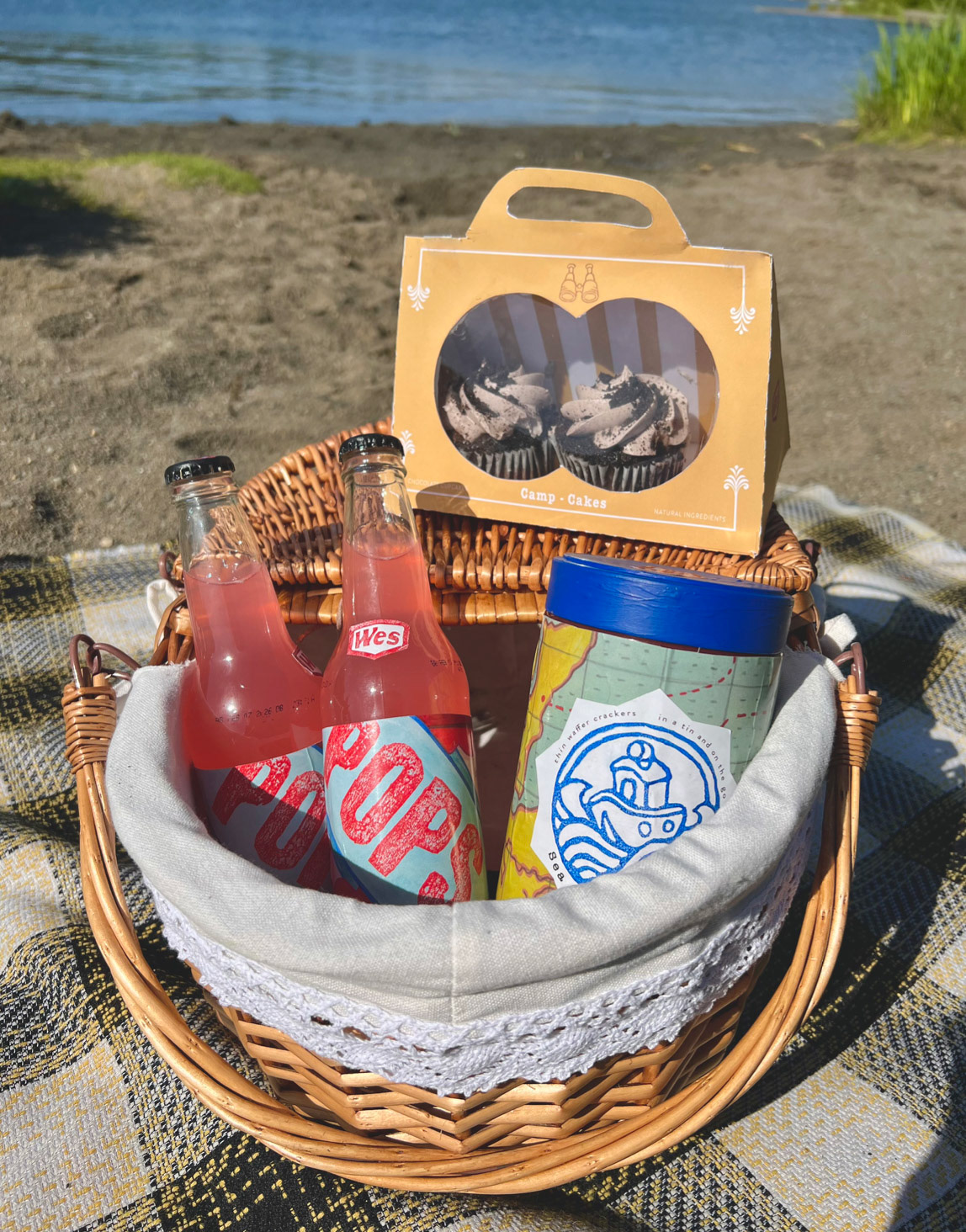
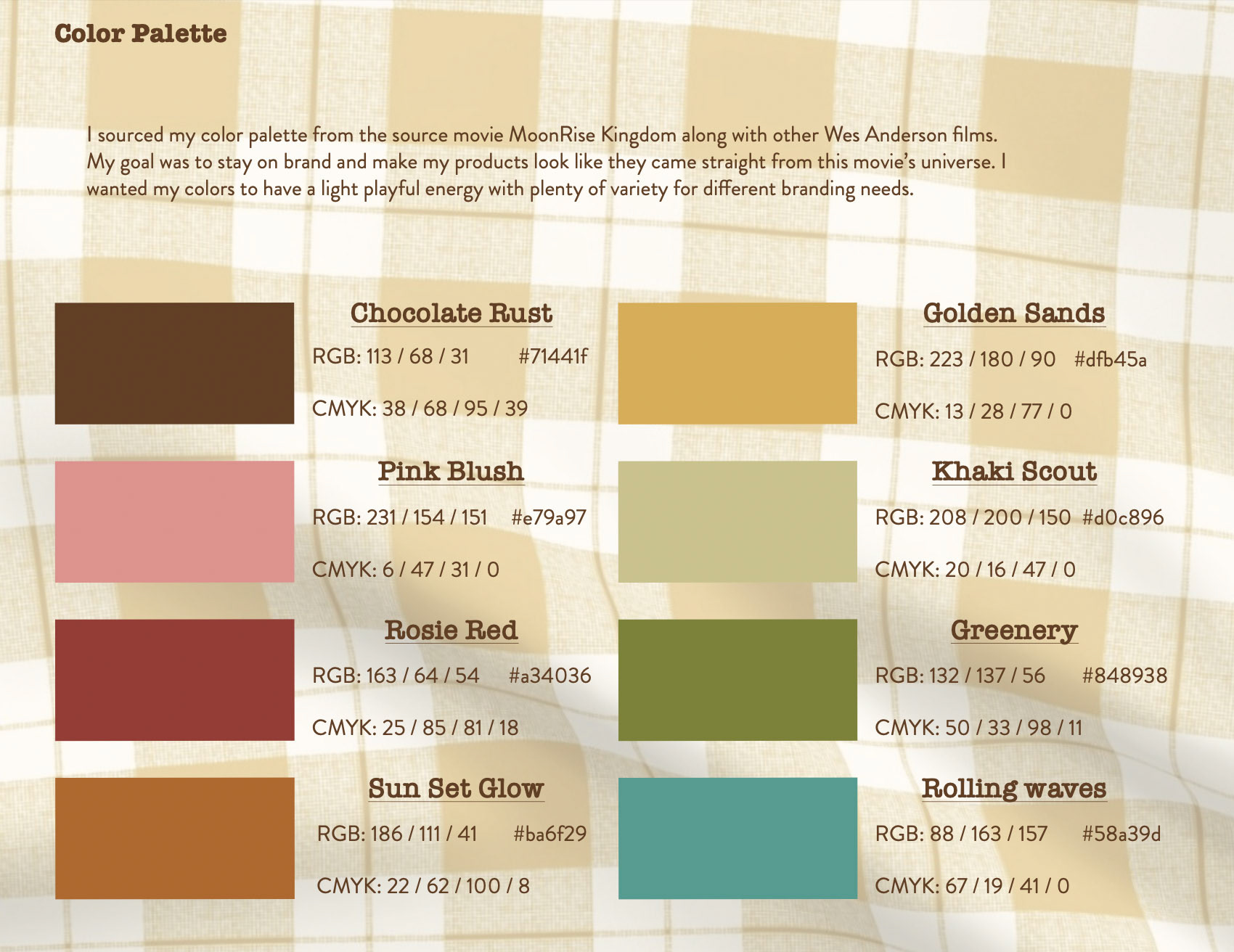
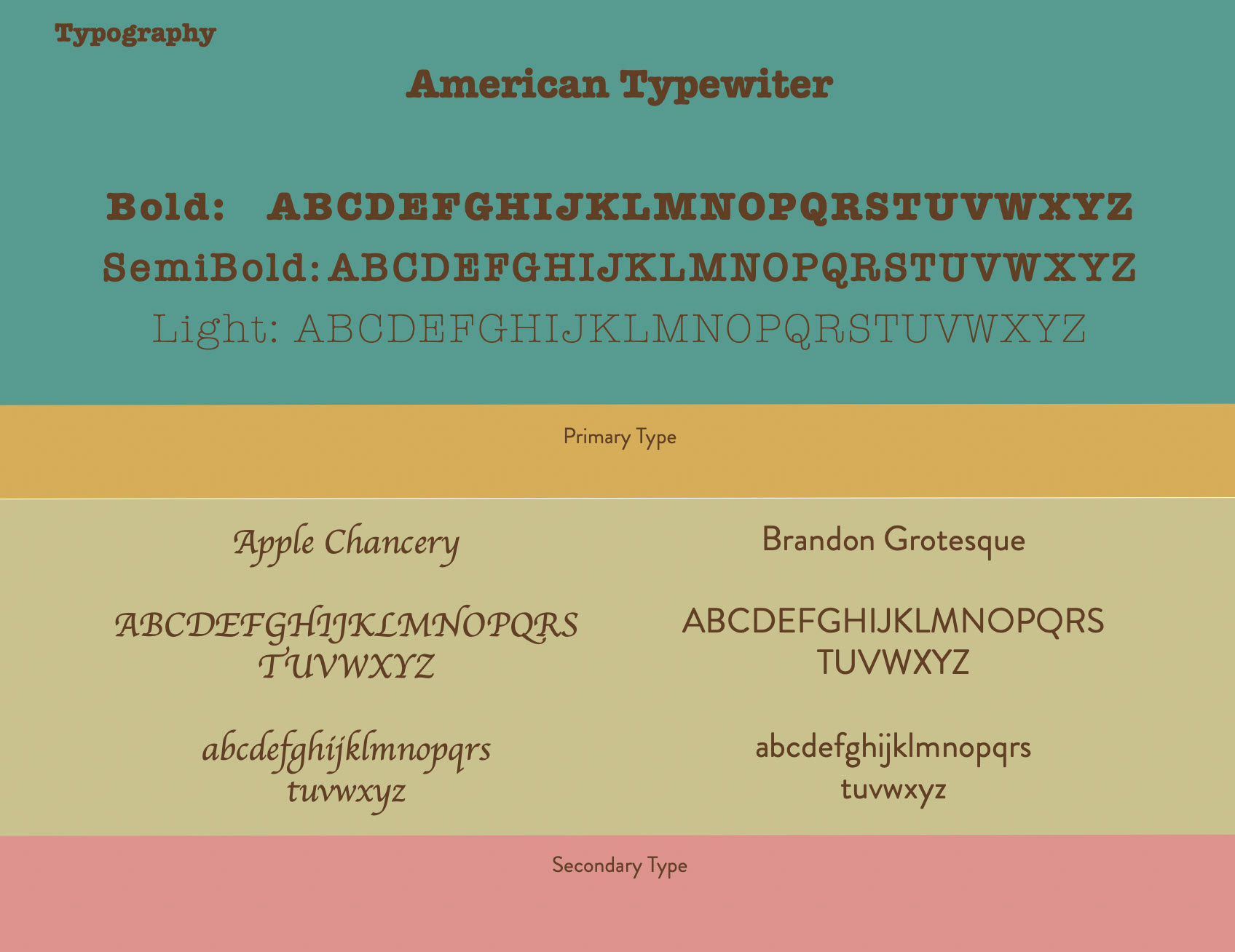
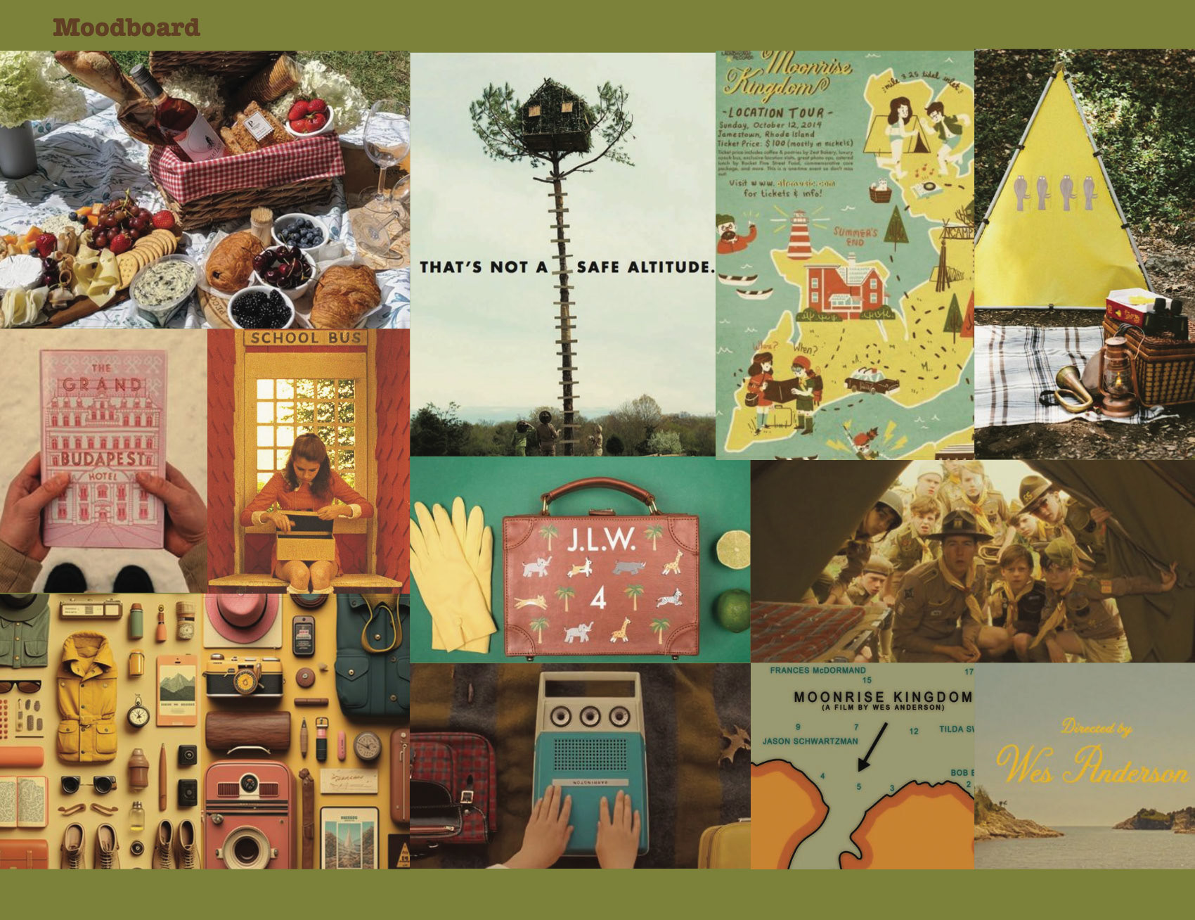
For my movie I chose Moonrise Kingdom, a Wes Anderson film that takes place on a small island in 1960. This is one of my favorite films, I was deeply inspired by the energy of the characters, color pallet, set design, and of course Wes Andersons distinct symmetrical style. I planned on creating a line of food products that would be bought for a picnic on the beach. This includes cheese, crackers, jam, sodas, and cupcakes. I wanted my products to look like they were all created on the small island found in my movie. My goal was for my designs to feel homemade, while at the same time have the symmetrical style of all of Wes Anderson’s films.
Deep Dive into the Process
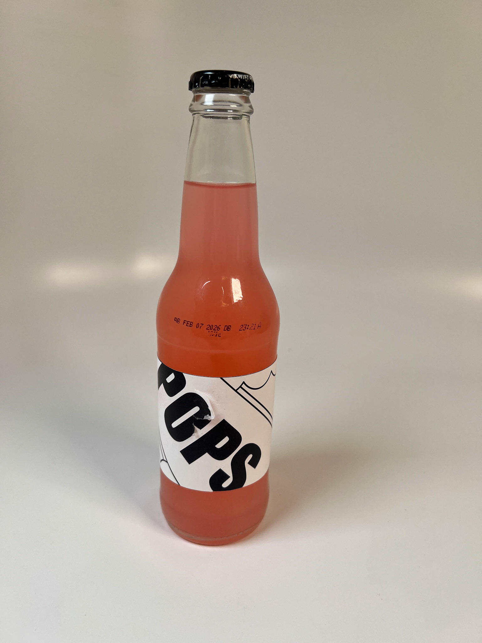
Pops - Soda Design
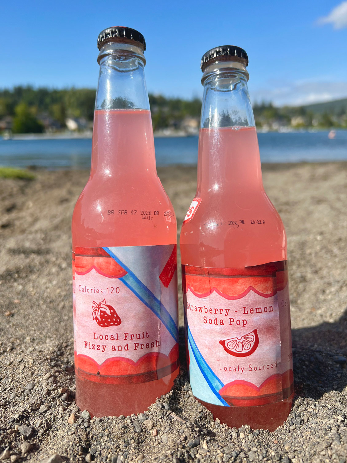
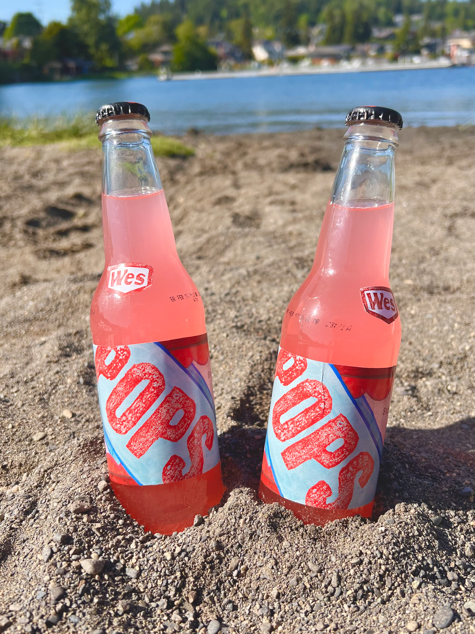
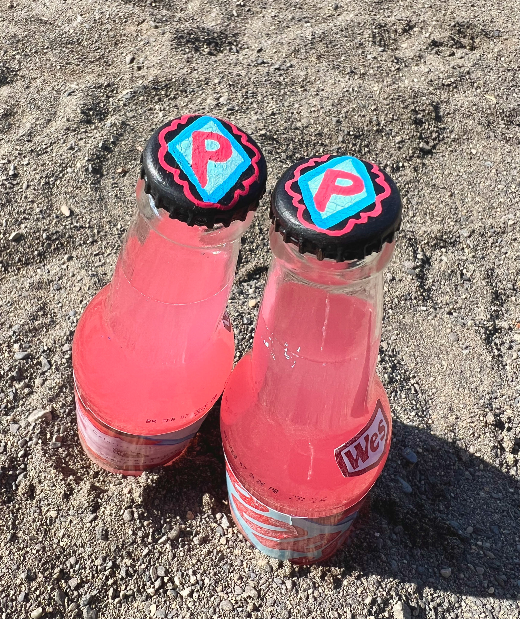
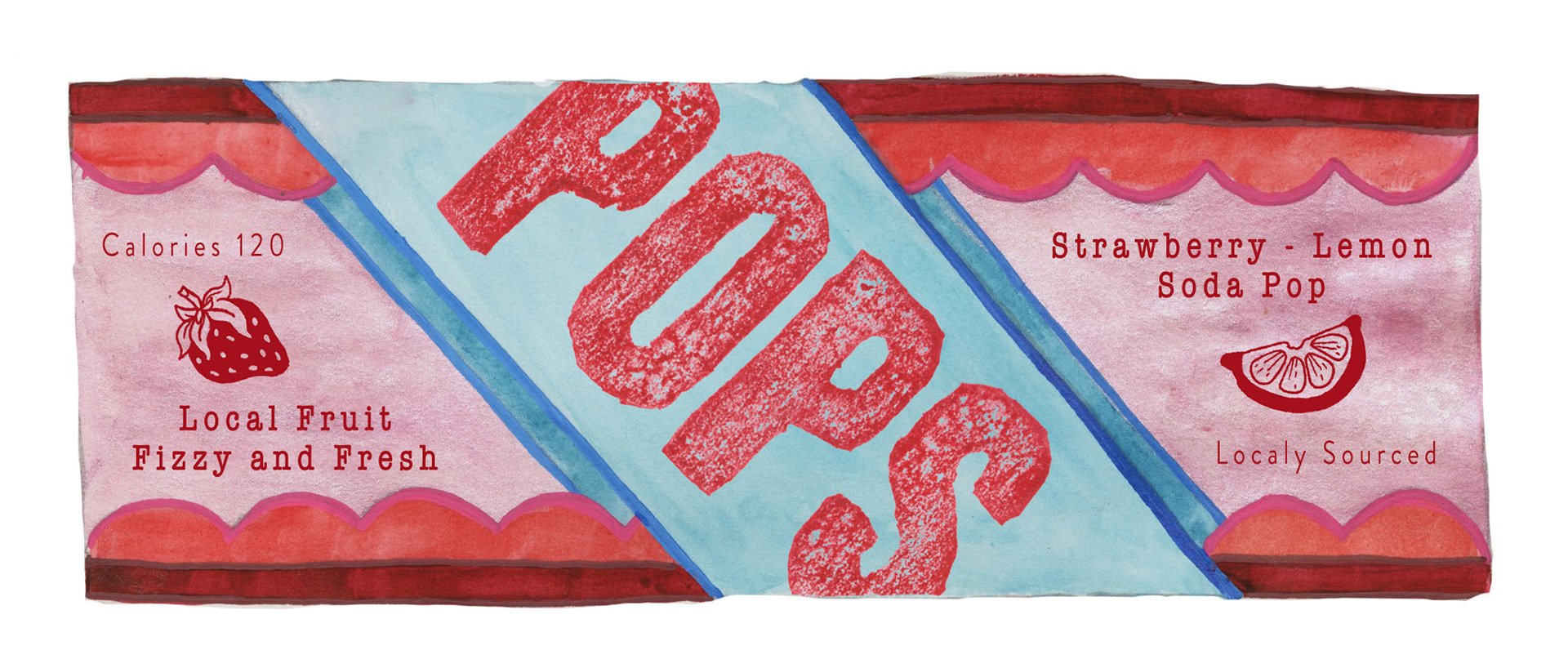
I wanted this soda to be simple in design but striking in color. To create this logo I started with concept work in adobe. After prototype testing the chosen design was brought into the physical where It was remade in watercolor. I carved the large typography as stamps and scanned the results to bring into the digital for editing. Once all of the assets were cleaned up they were assembled and printed out for the final prototype. I decided to paint the caps of the bottles by hand as a fun final touch at the end.
Final Comp
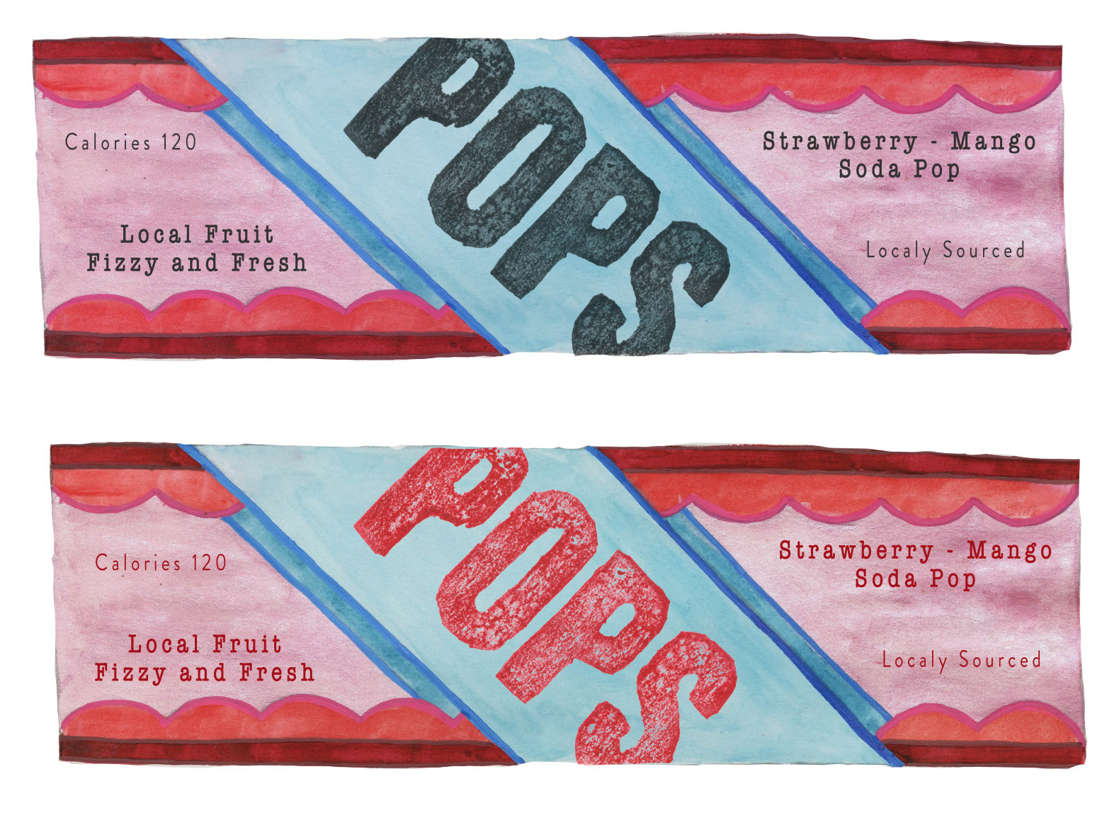
Early Iterations
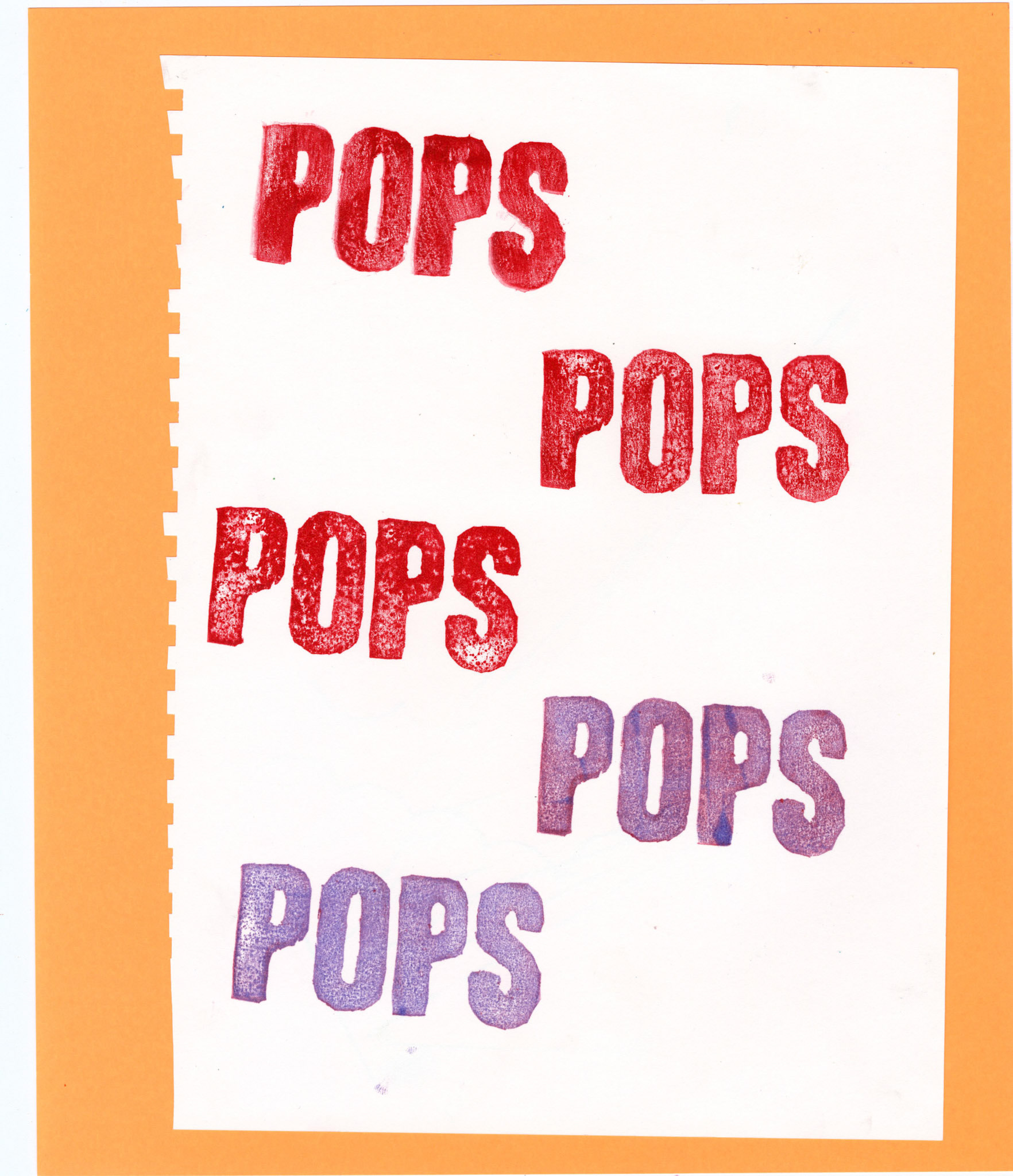
Pop Stamp

Watercolor Background
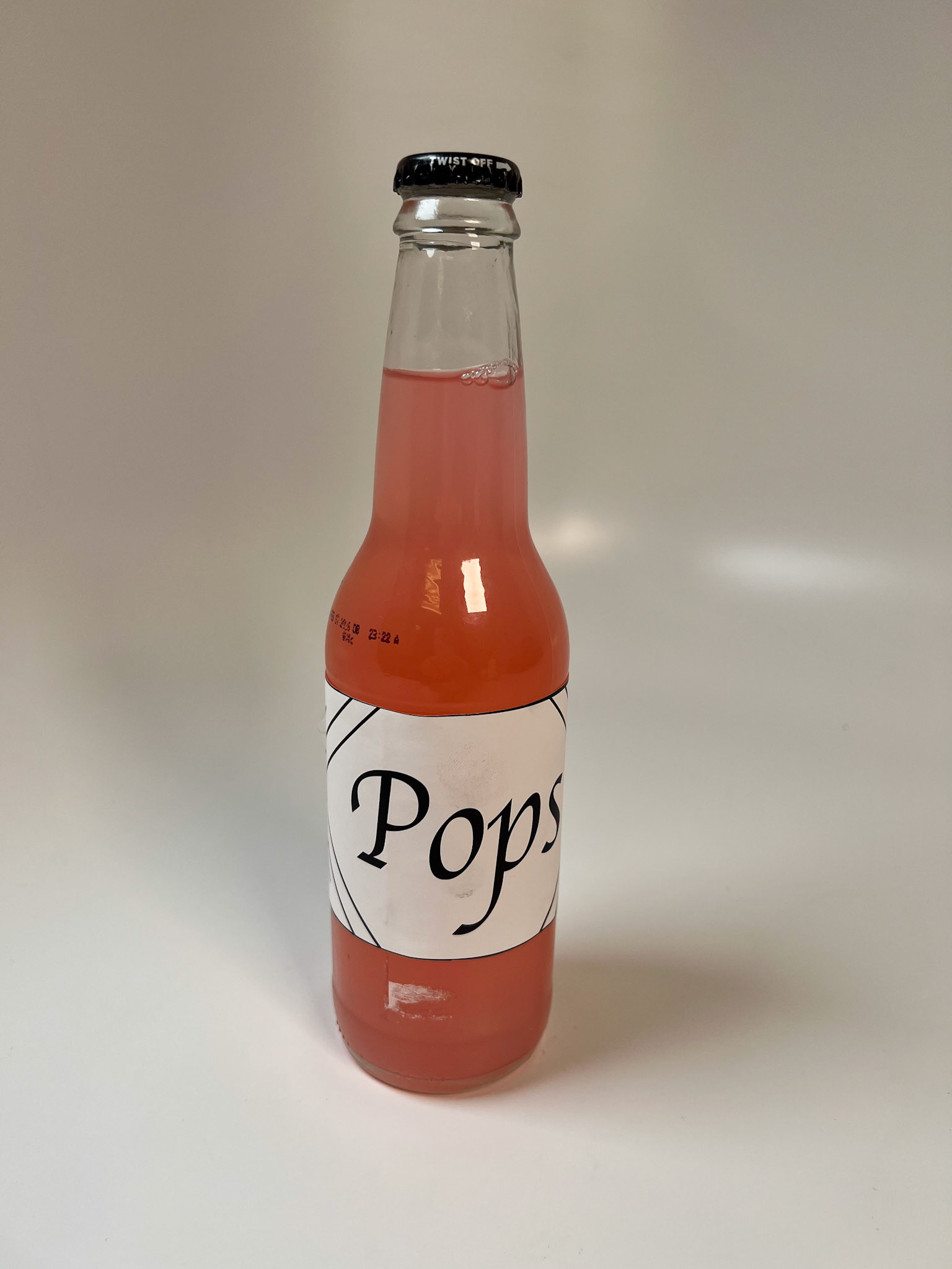
Early Prototype 1
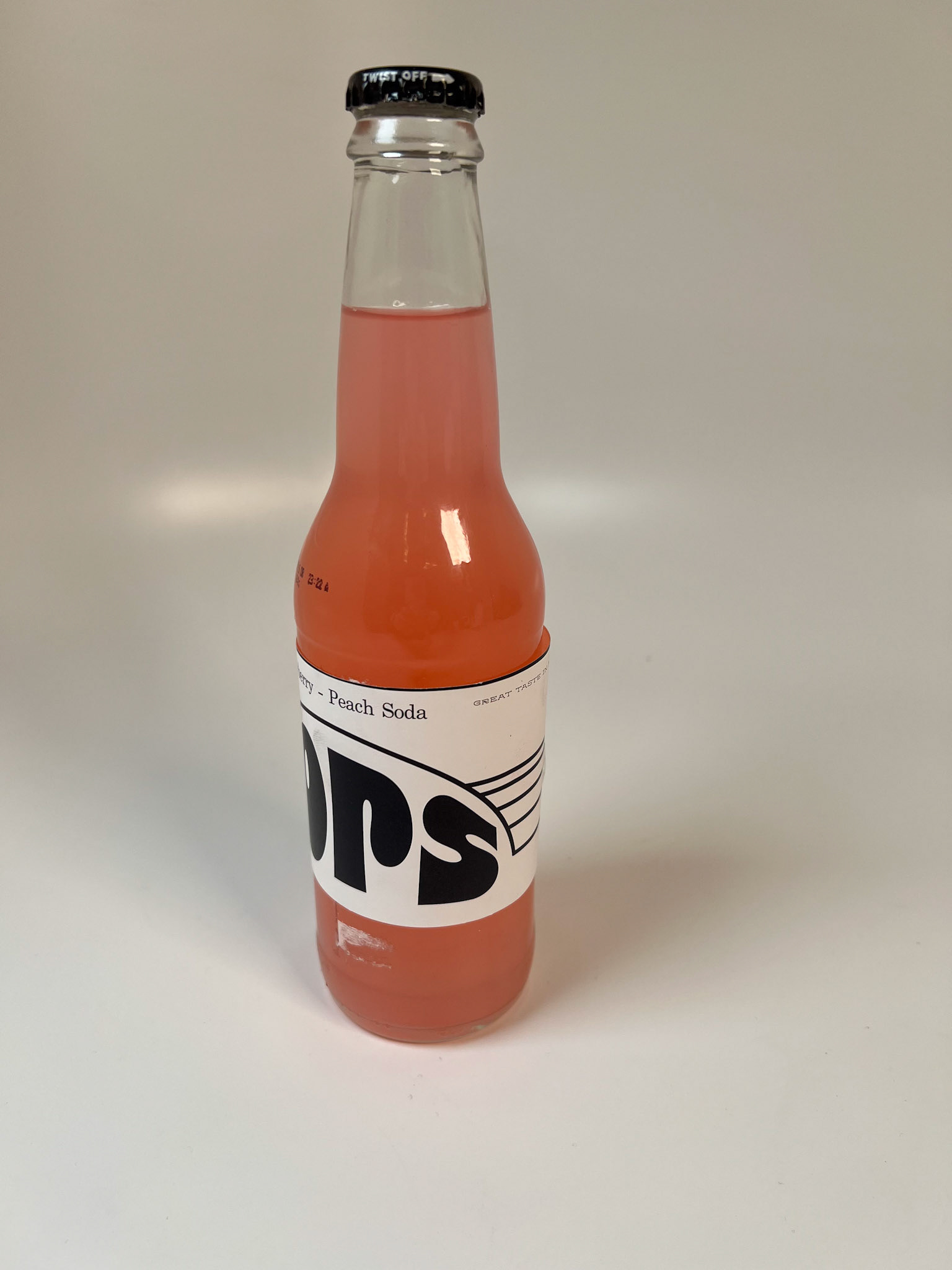
Prototype 2
Prototype 3
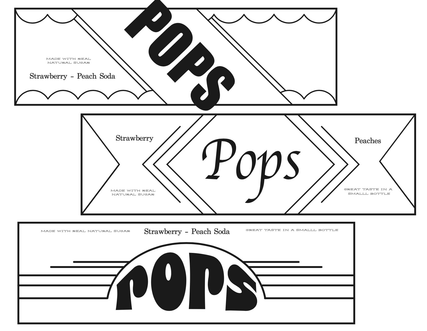
Early Framework Designs
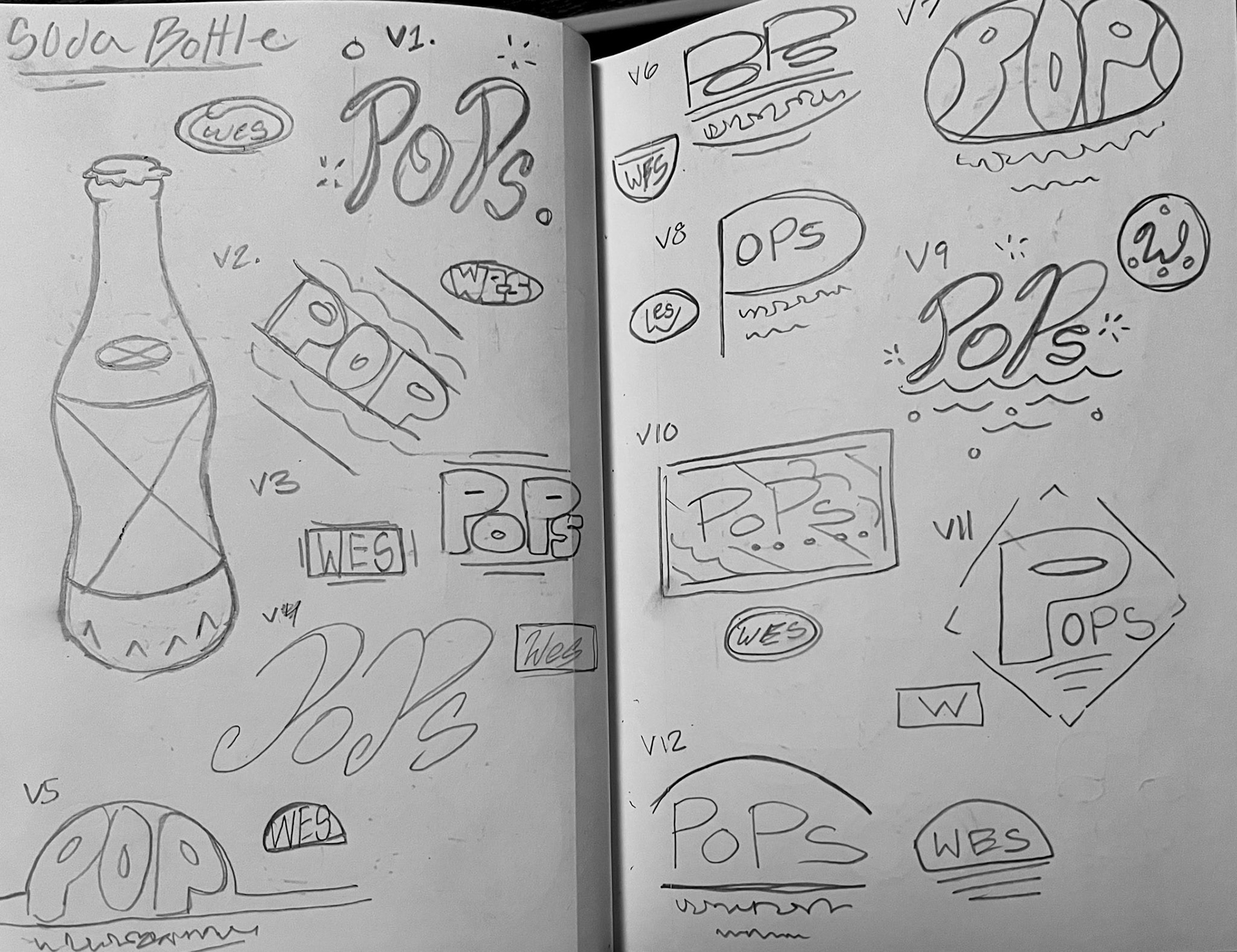
Concept Sketches
Sailor Cracker Tin
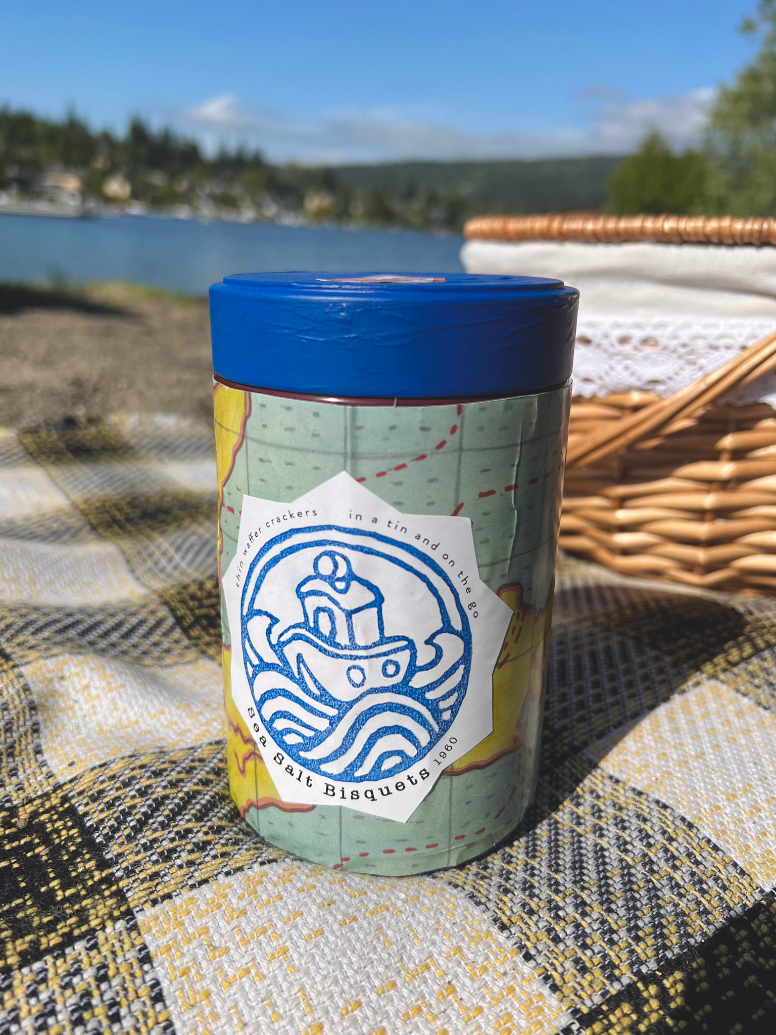
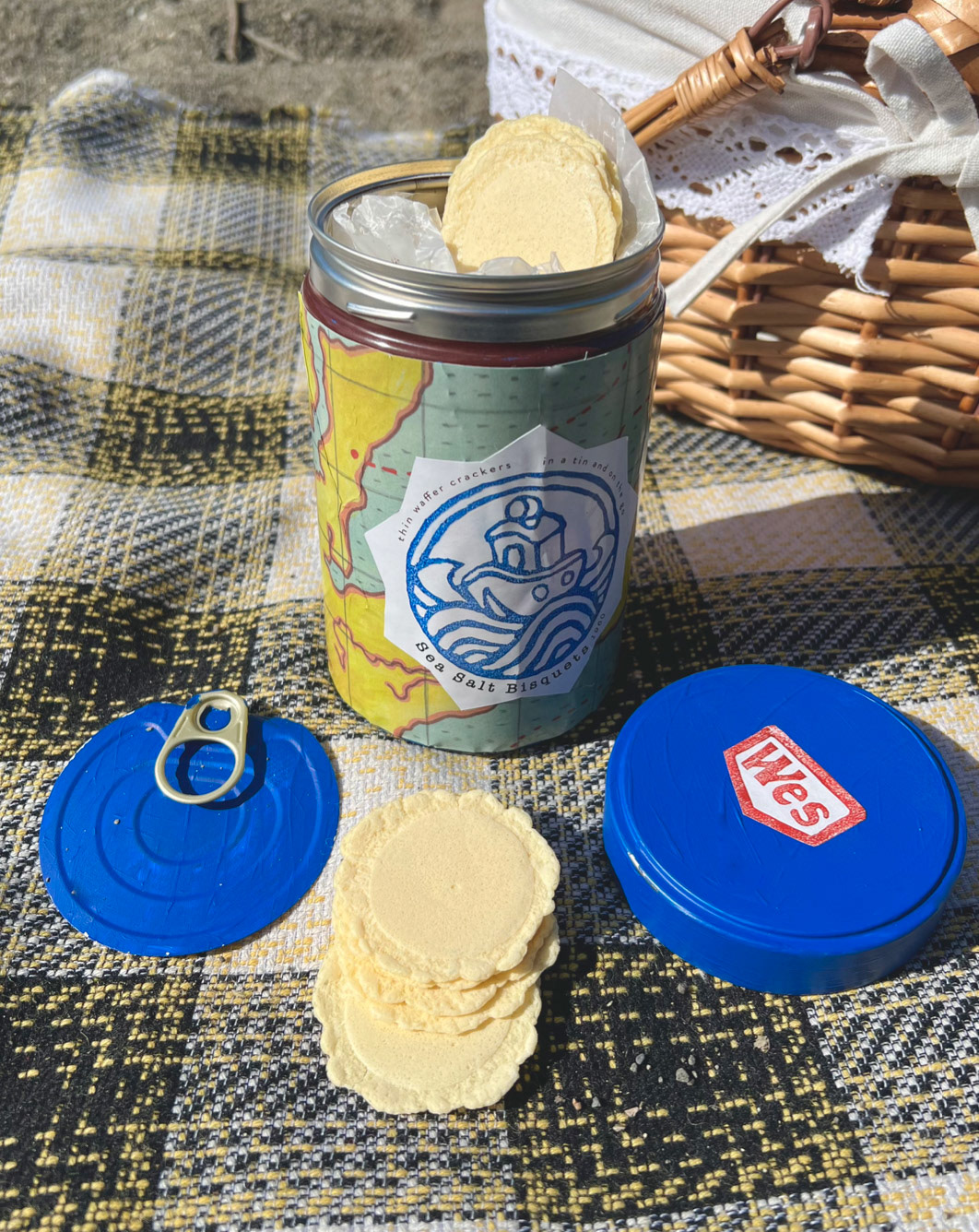
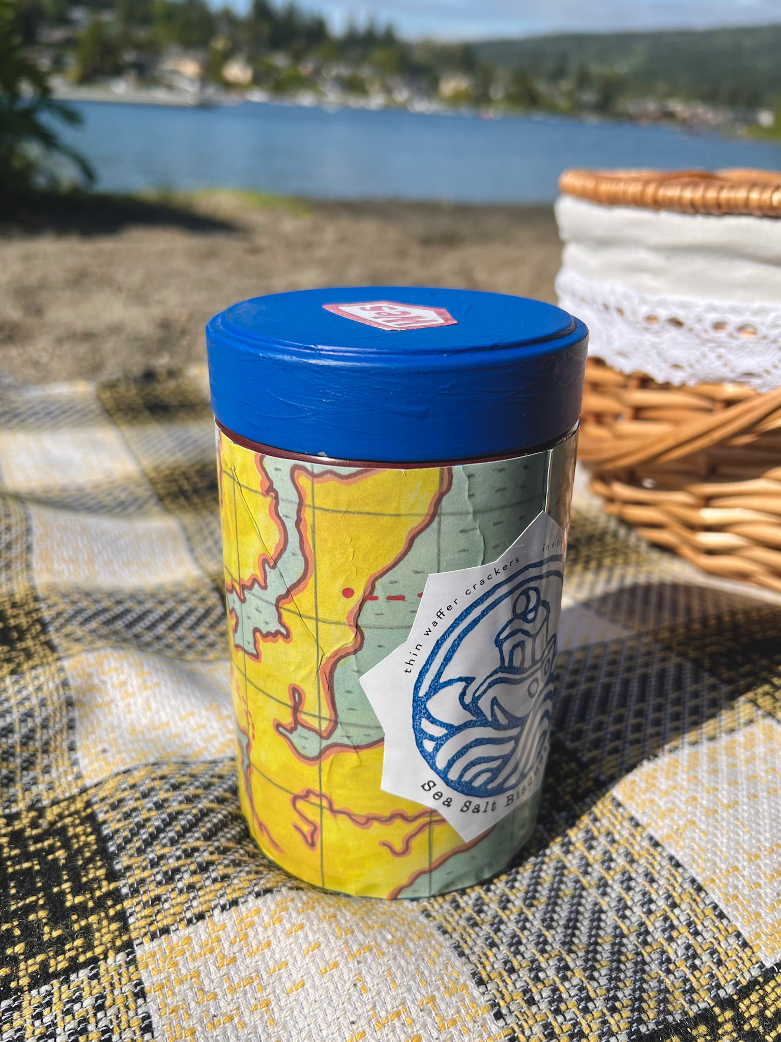
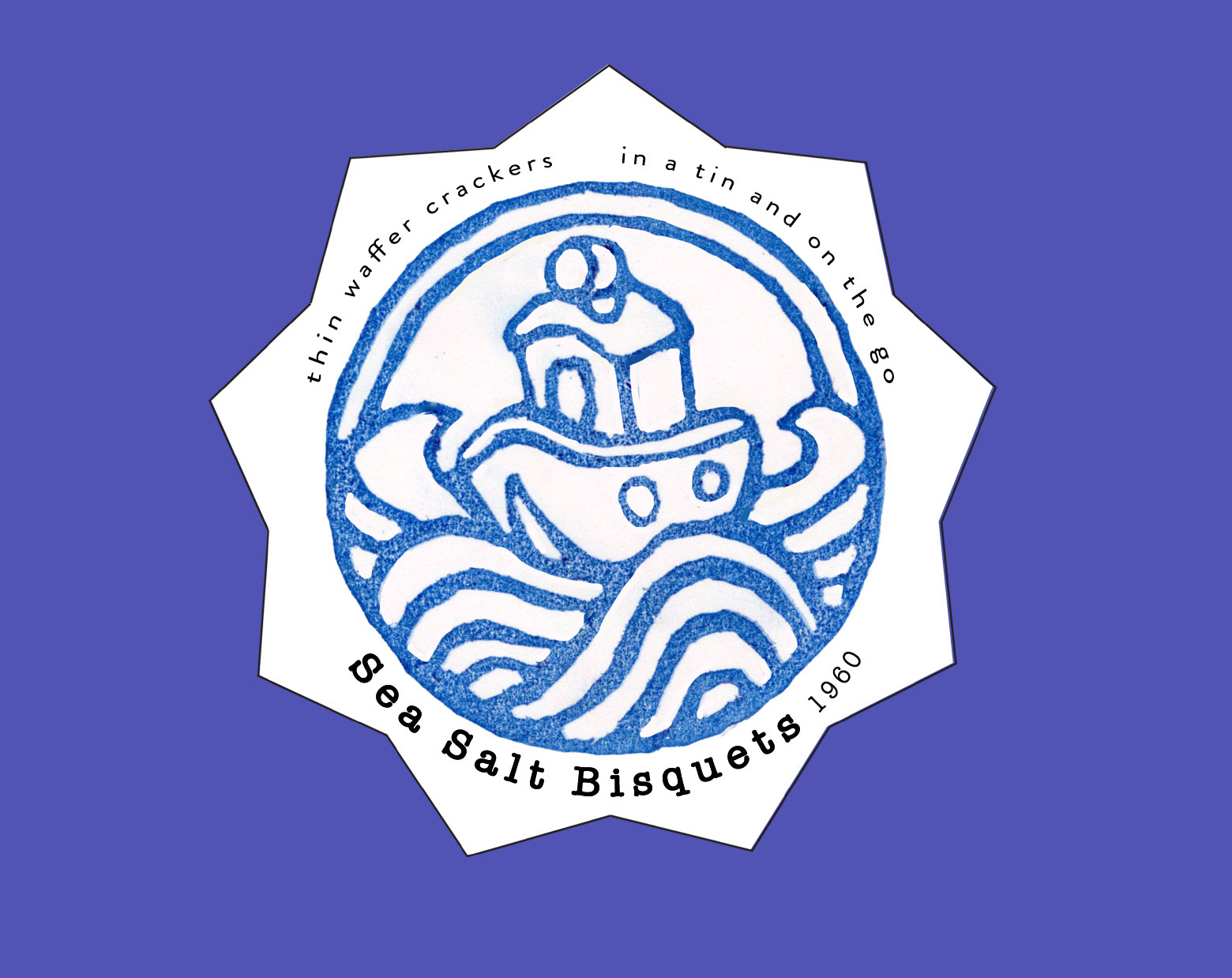
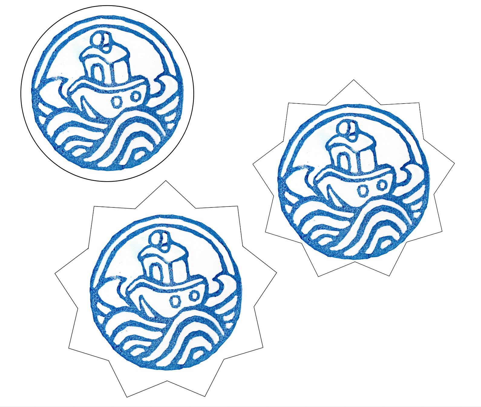
I had a very clear vision for this cracker tin, it was one of the first products that I thought up. I tested many versions at the beginning of the process but in the end my original idea worked the best in practice. This is rare but very exciting when it happens in a project, so that made this tin one of my favorite things to make. I started with a cleaned out coffee tin and painted it to fit my color pallet. Then for the logo I designed it in the digital space and brought to the physical by carving it into a stamp. Once the stamp was edited and reformed it was ready to go on the final package. The map wrapping was one of my favorite touches of this piece. It is a watercolor design inspired by the original island map featured in the movie.
Boarder Tests
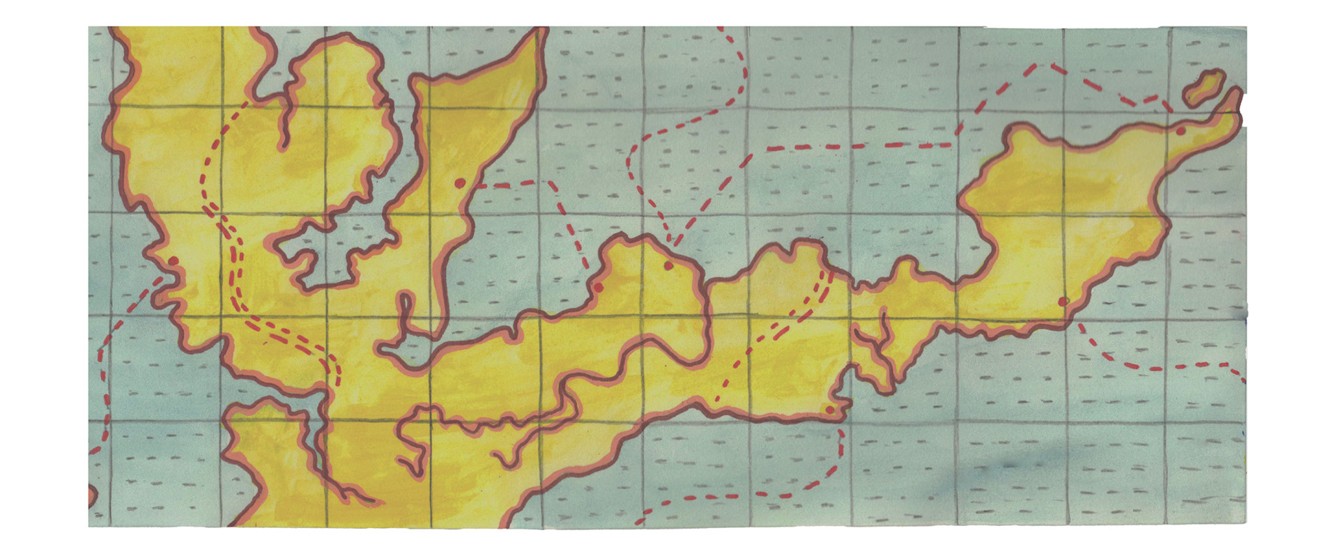
Final Watercolor Map
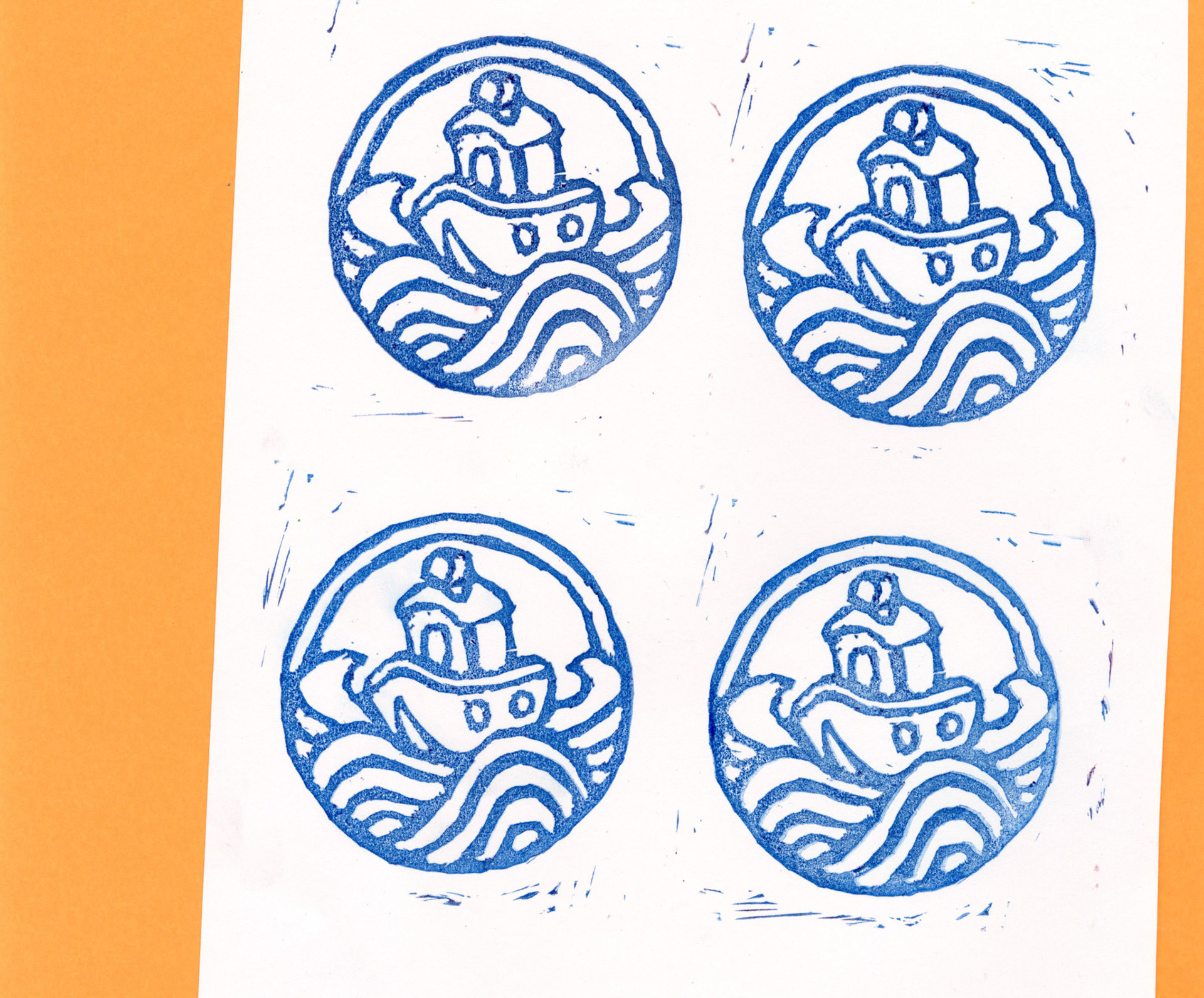
Boat Stamp Tests
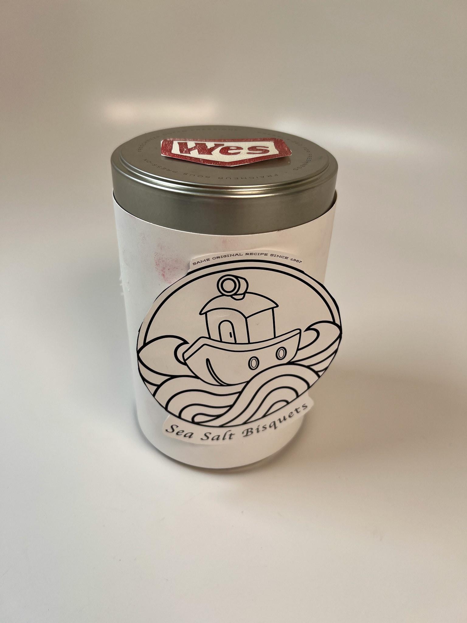
Early Prototype 1
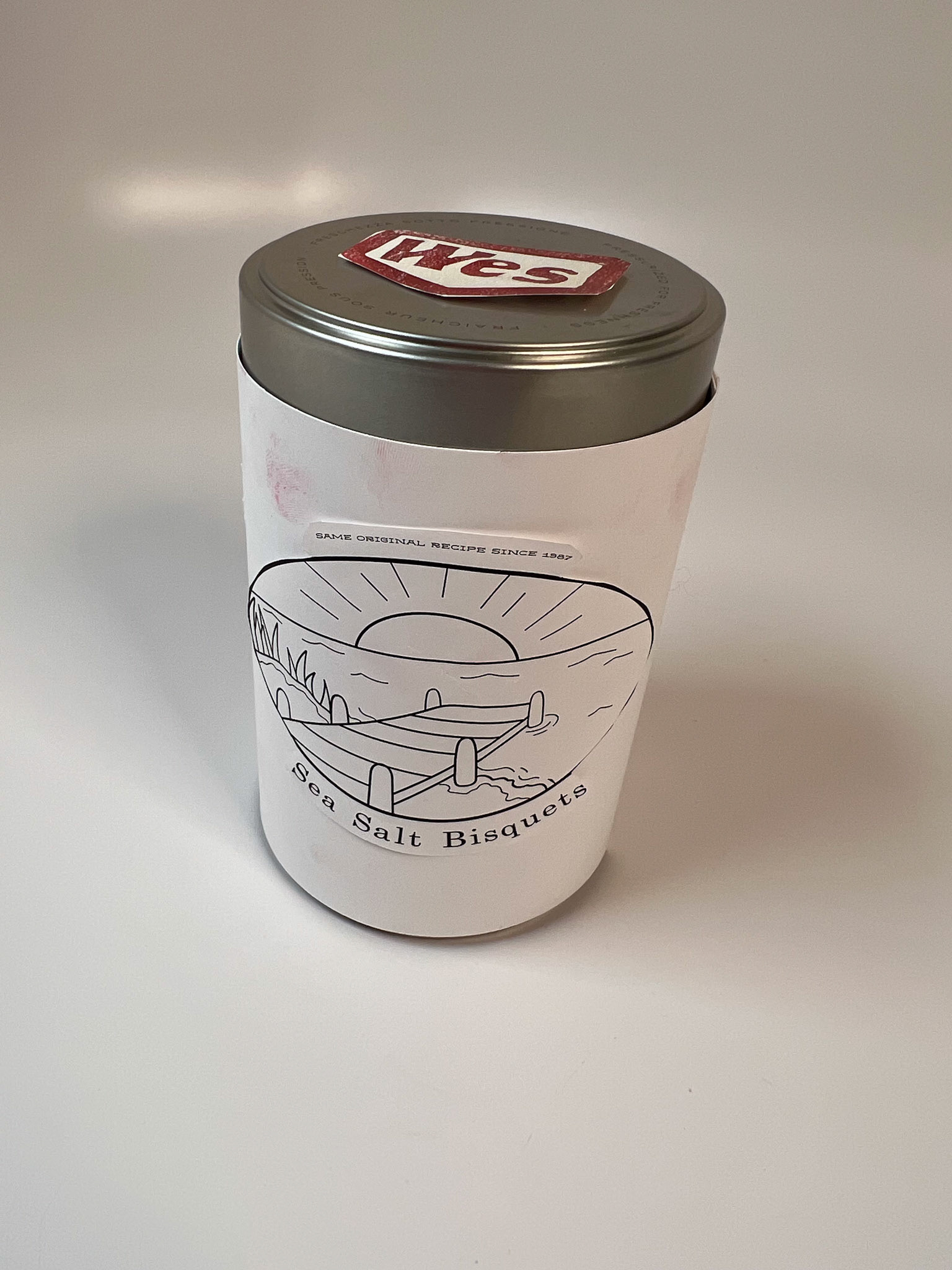
Prototype 2
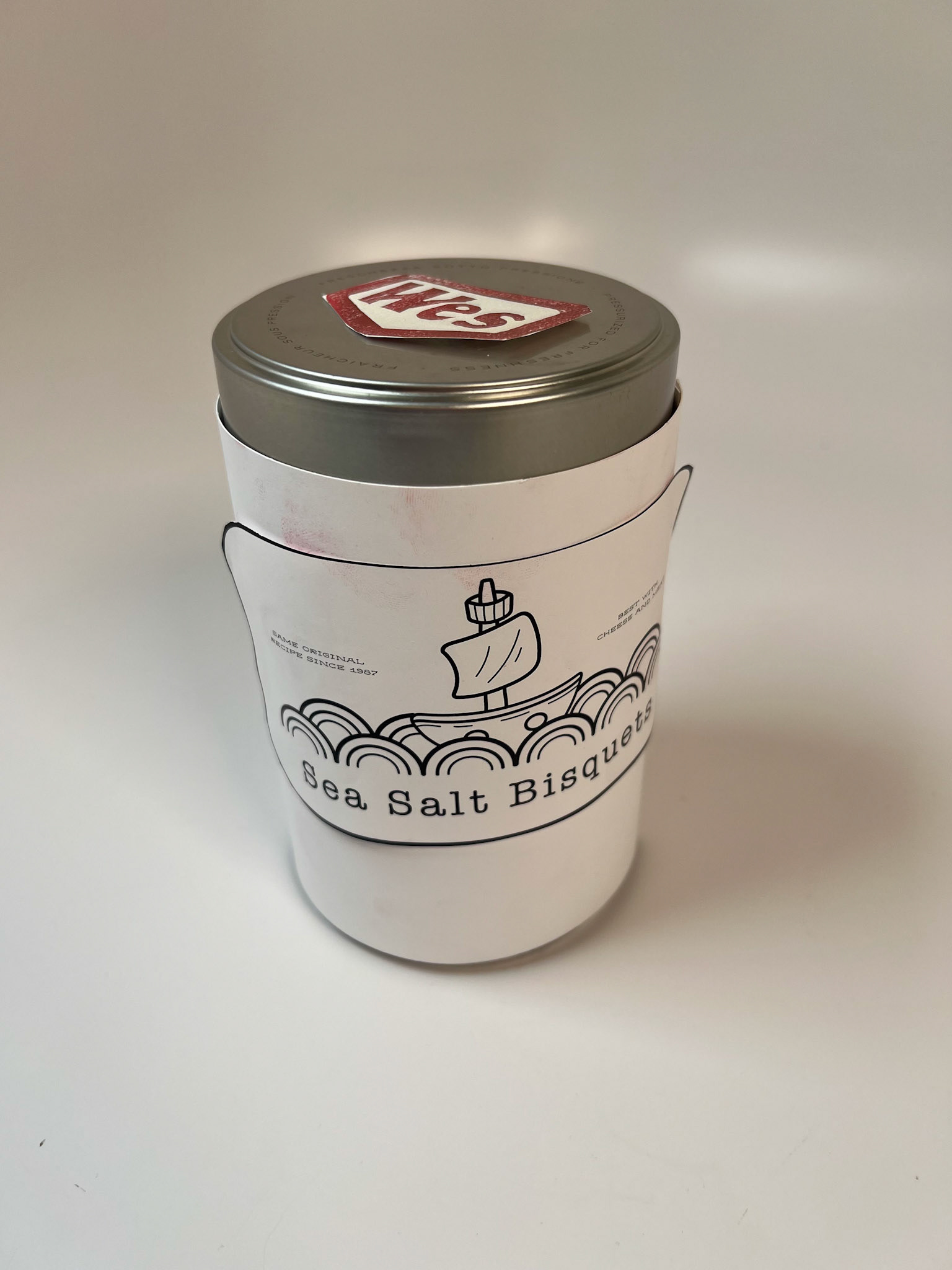
Prototype 3
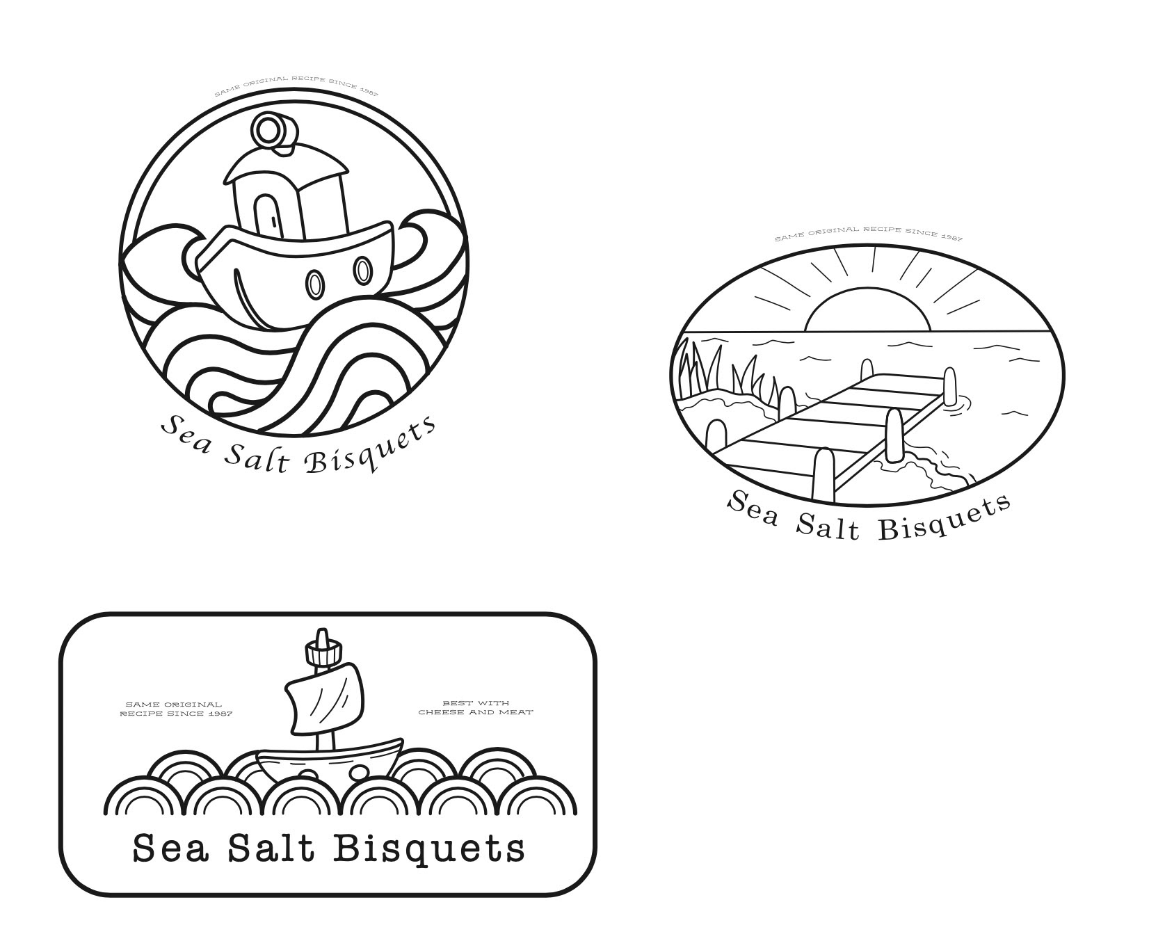
Early Framework Designs
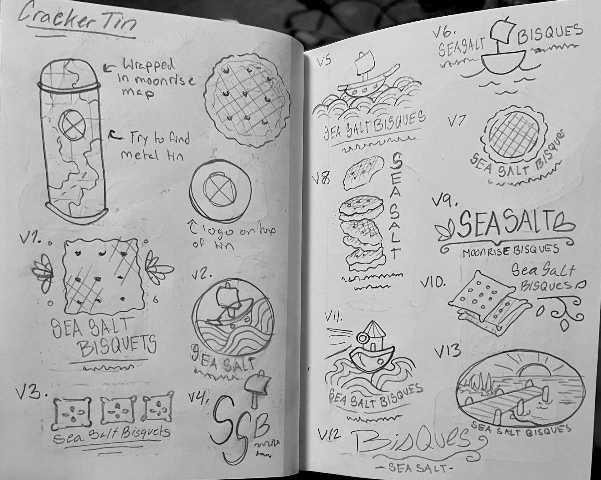
Concept Sketches
Travel CupCake Box
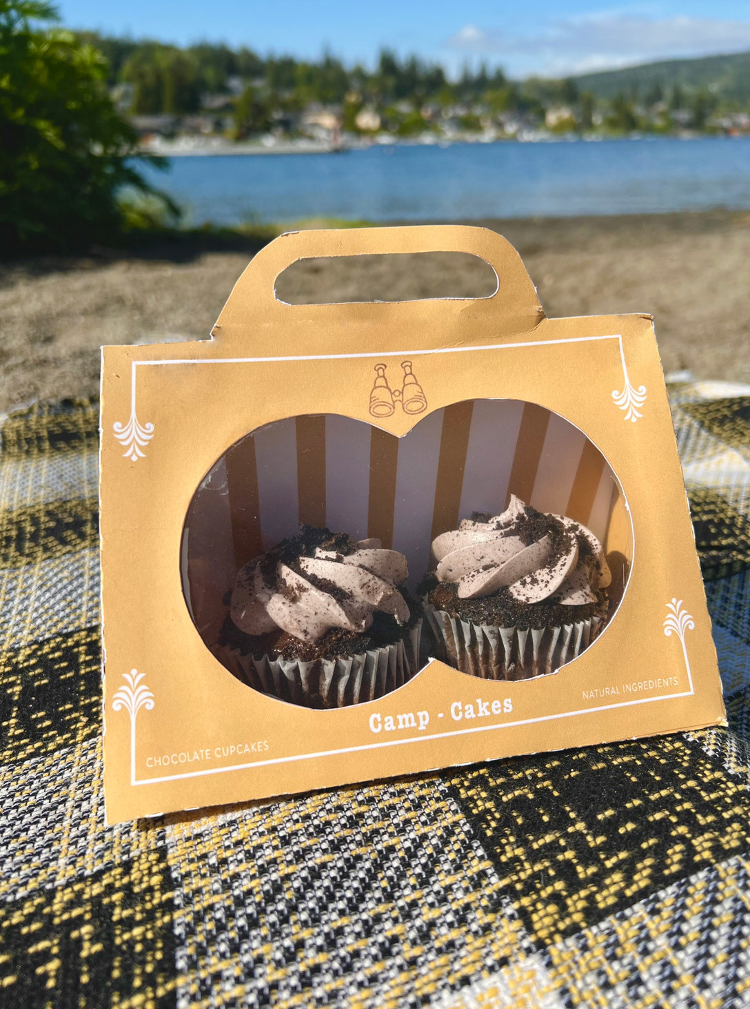
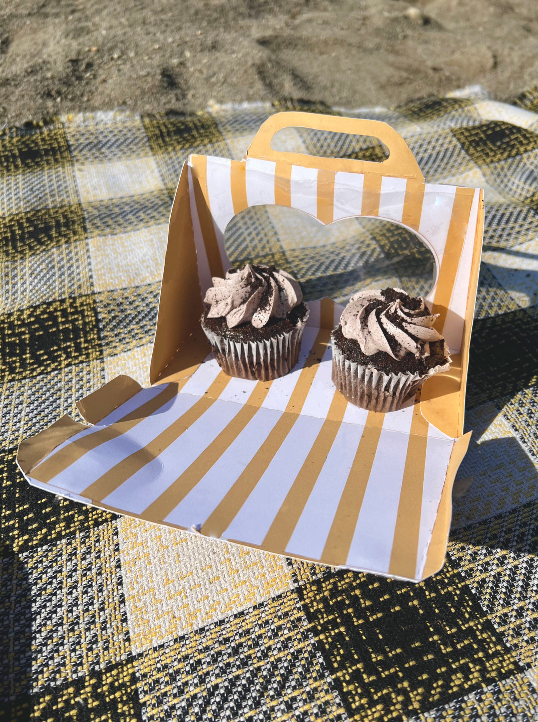
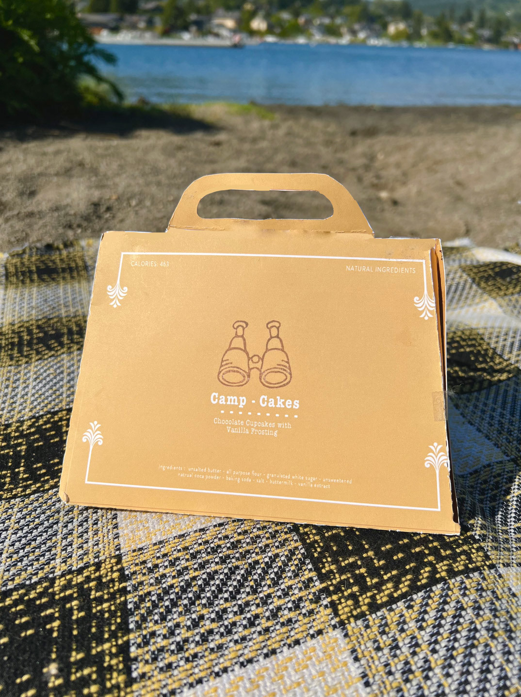
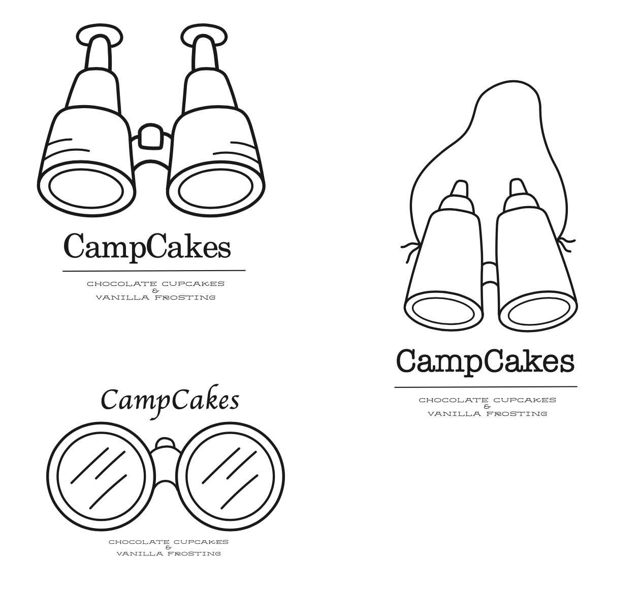
This product had a simple design but ended up being very satisfying to assemble. My goal was to create a hand held cake box inspired by the little yellow scout tent shown in my film. The box itself consists of thick card stock paper and a bit of transparent sheeting for the display window. I designed this box to be easily opened and securely closed for transport. The little window on the front frames the cakes inside with a shape inspired by binoculars, another film reference. This reference can also be seen in the logo design with the stamp of binoculars as the main feature. This stamp was made physically then edited in the digital space along with typography consistent with the other already produced products.
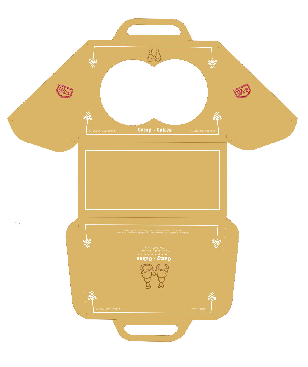
Box Design Outside
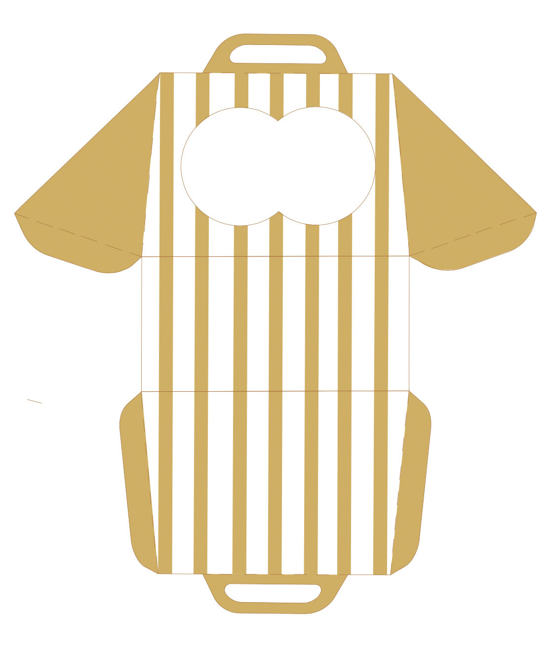
Box Design Inside
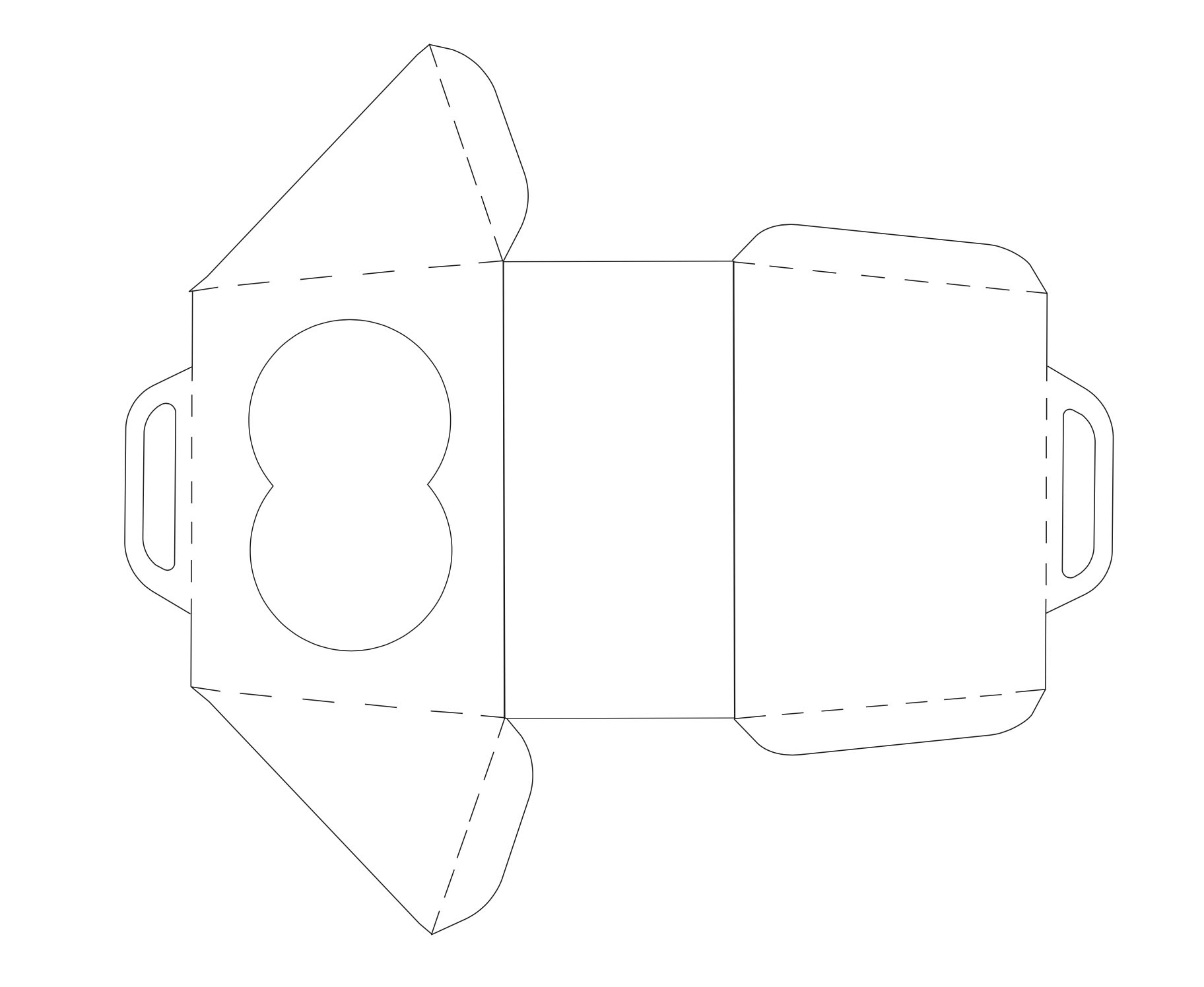
Box Framework Design
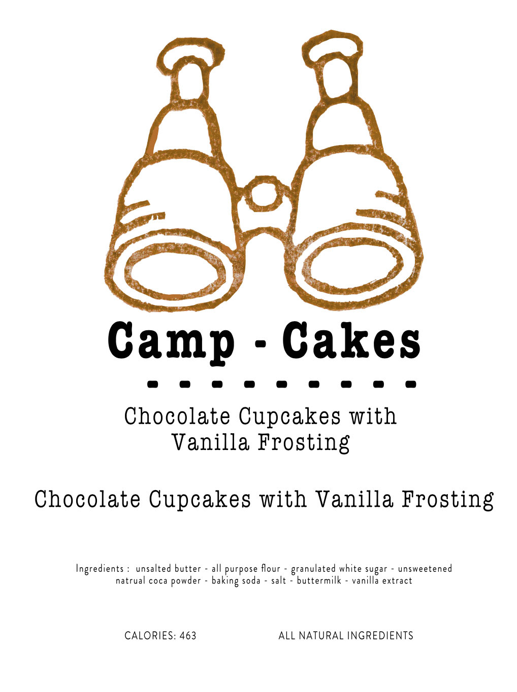
Final Logo Design
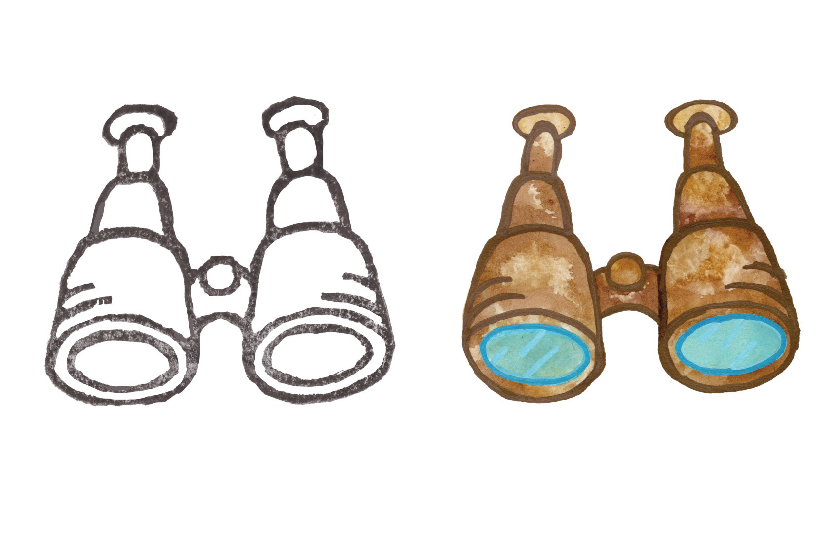
Logo Experiments
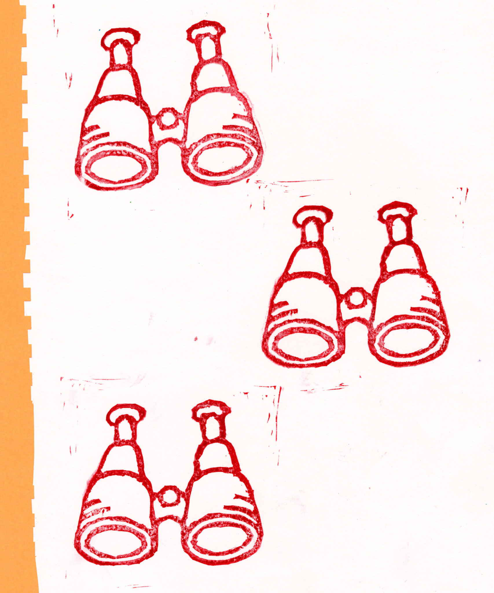
Stamp Tests
Early Framework Designs
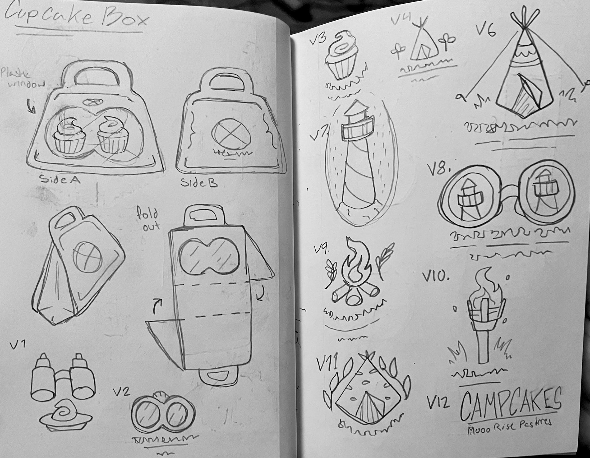
Concept Sketchs
Plum and Raspberry Jams
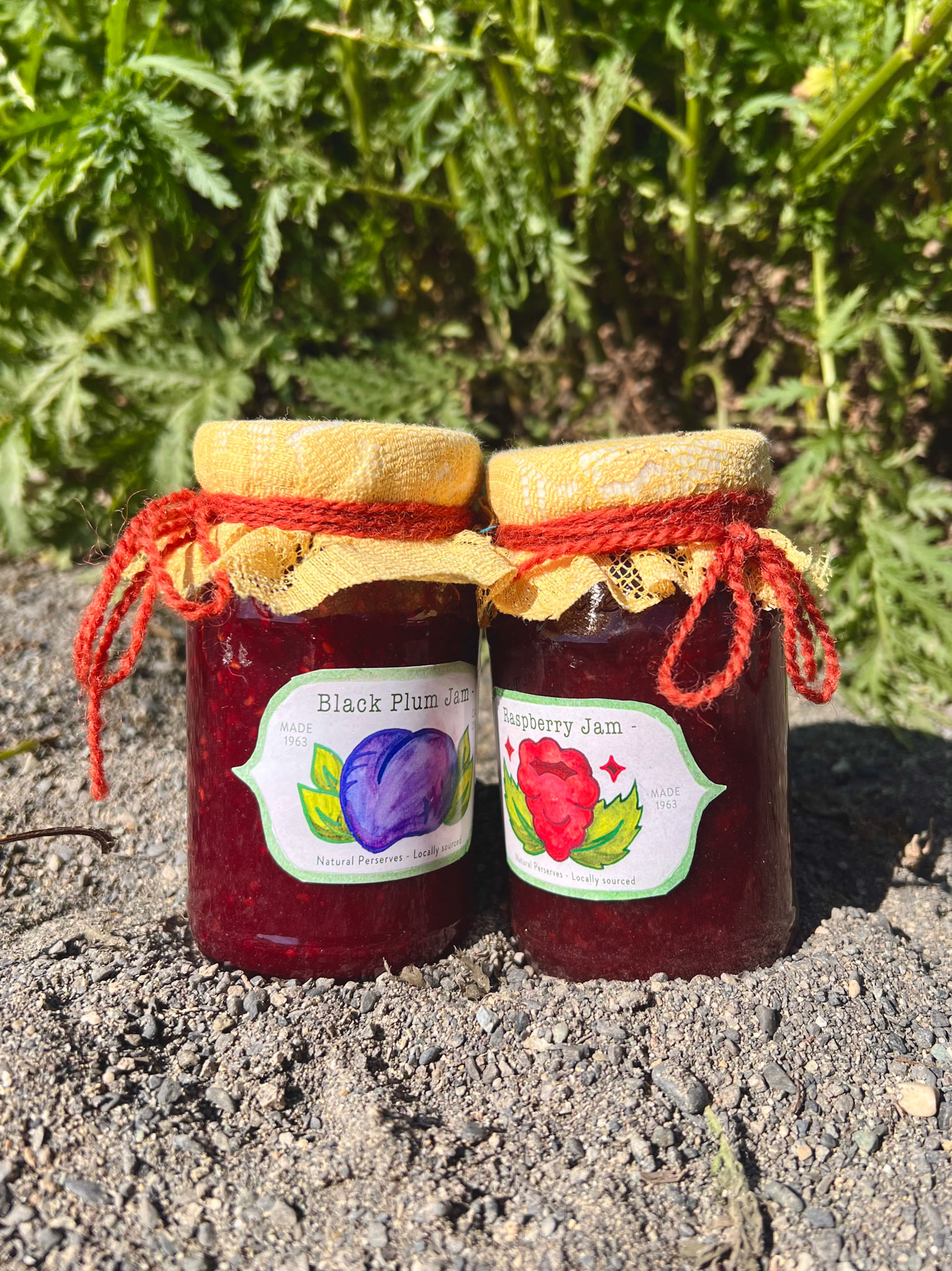
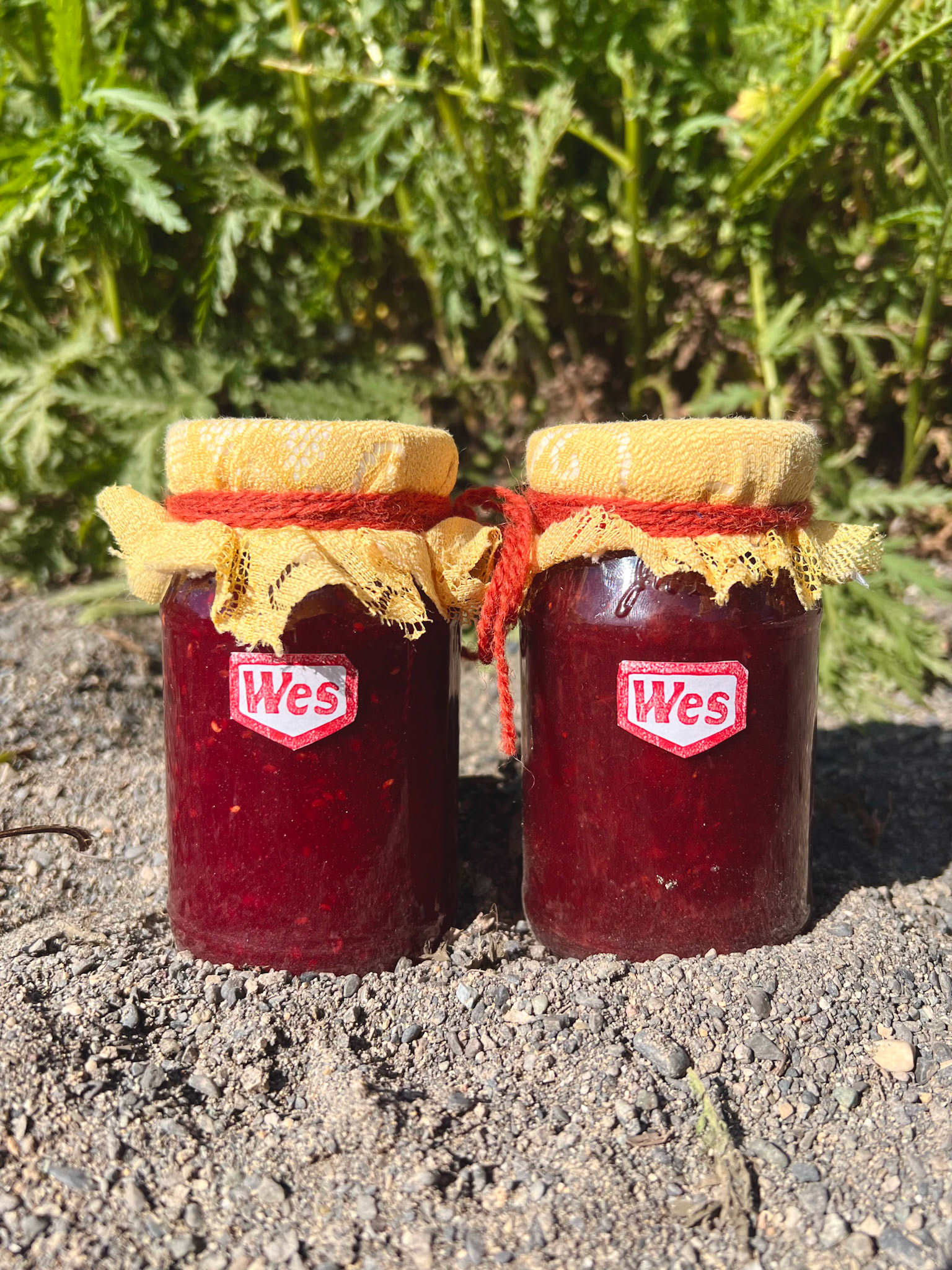
This product idea was simple but fun to create. My goal was to make jam that looked like it was sold at a small business but still be symmetrical like most things in the film. The logo was the most complicated part of the design. I started with a simple boarder using a carved stamp, to match the patterning on the other logos in the set. Then I designed and painted the fruits as the centerpiece. After these assets were edited in the digital space I finished it off with some simple typography. The top of the jam was a finishing touch I decided on at the end of the process. I used recycled fabric and felt to cover the lid then secured it with a twine bow.
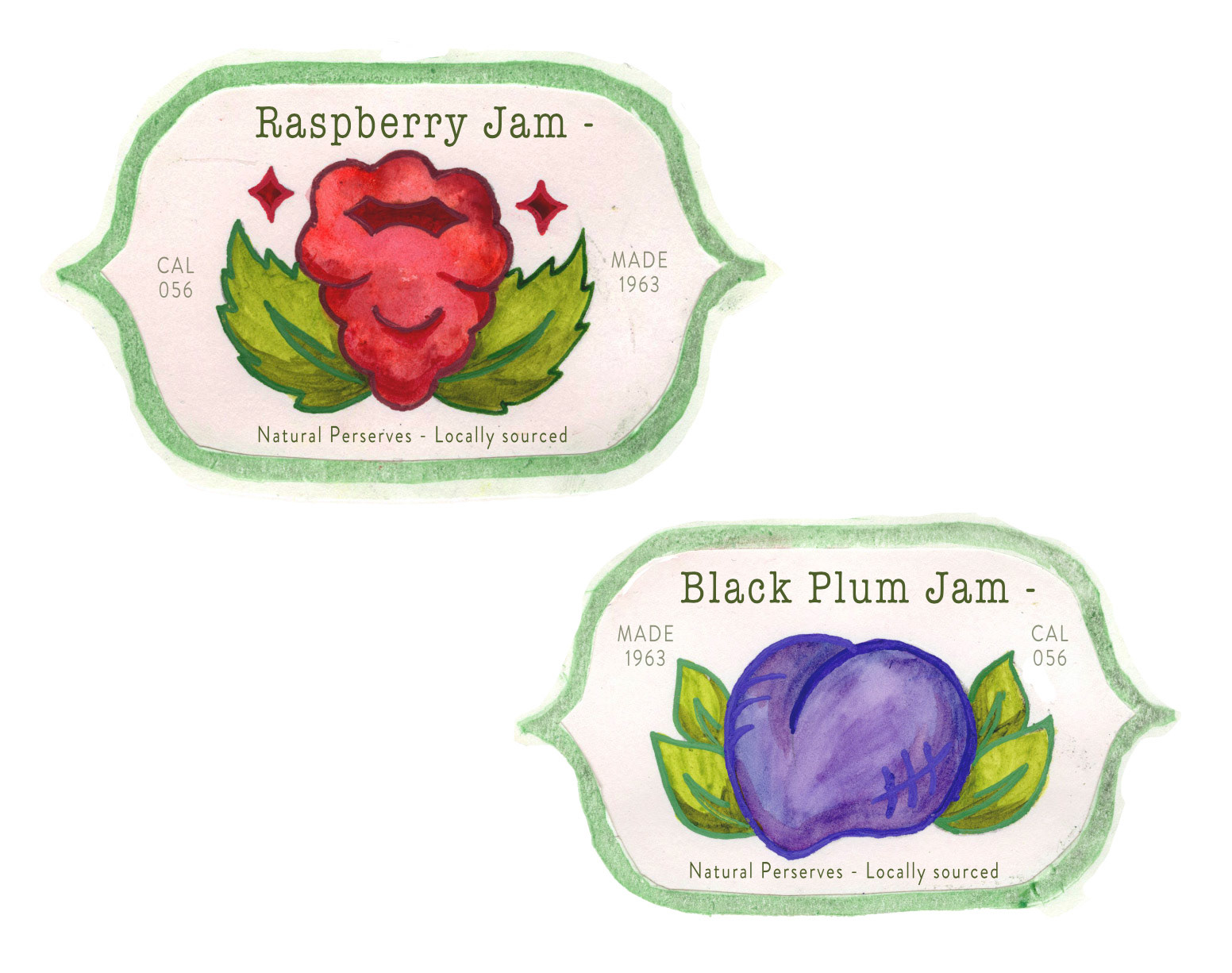
Final Designs
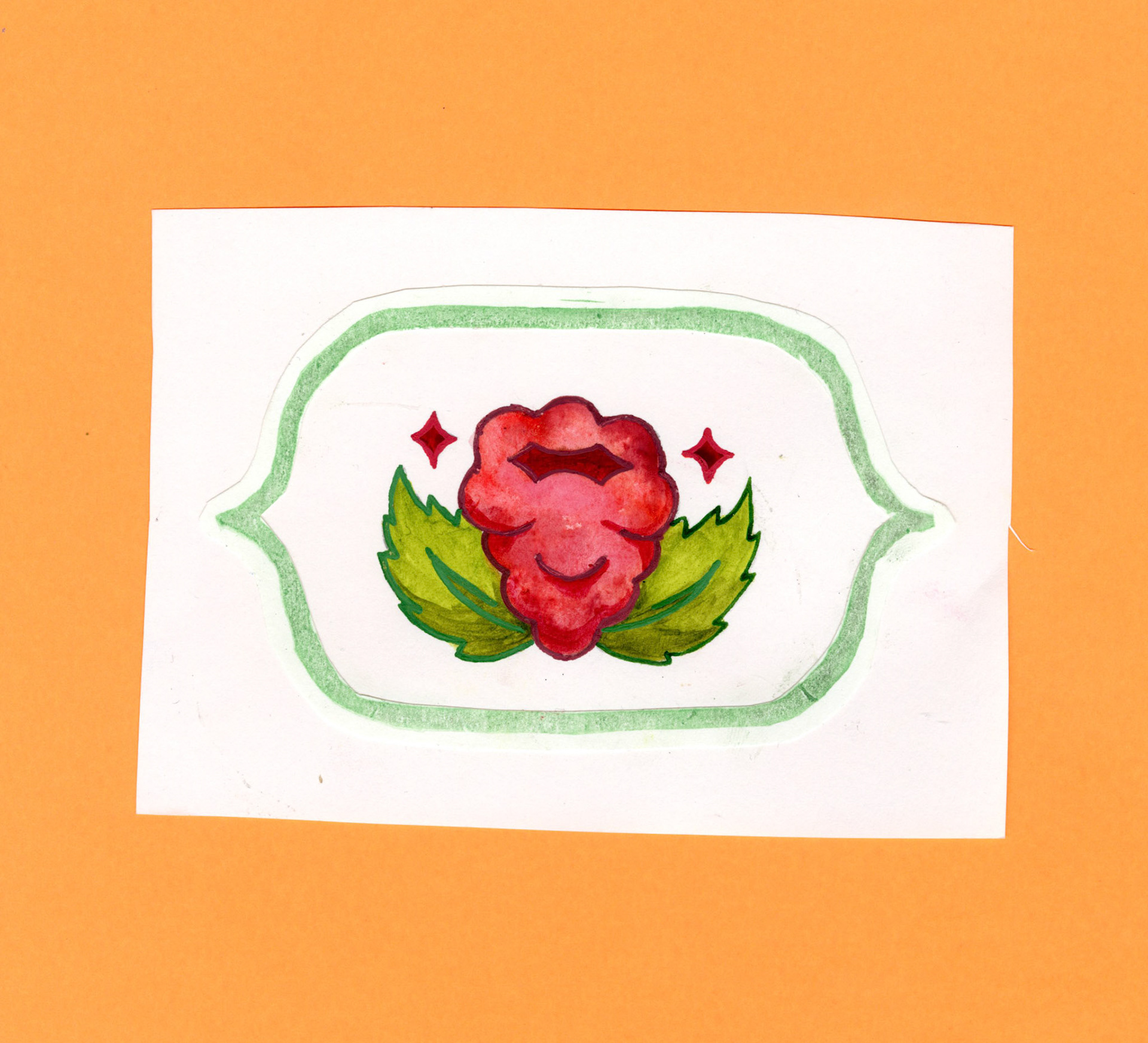
Stamp and Watercolor Design 1
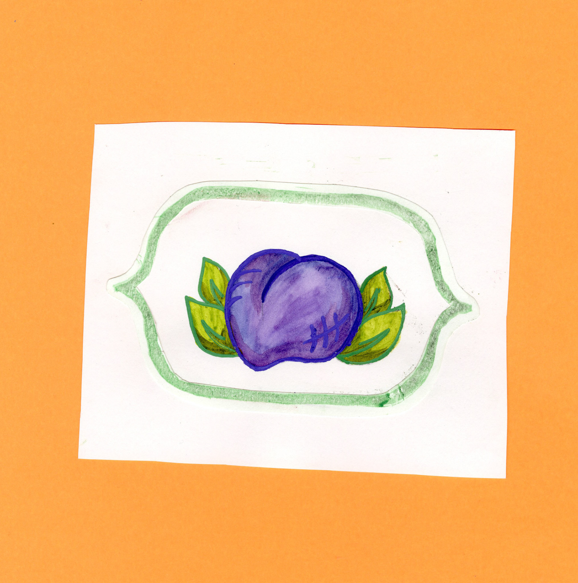
Stamp and Watercolor Design 2
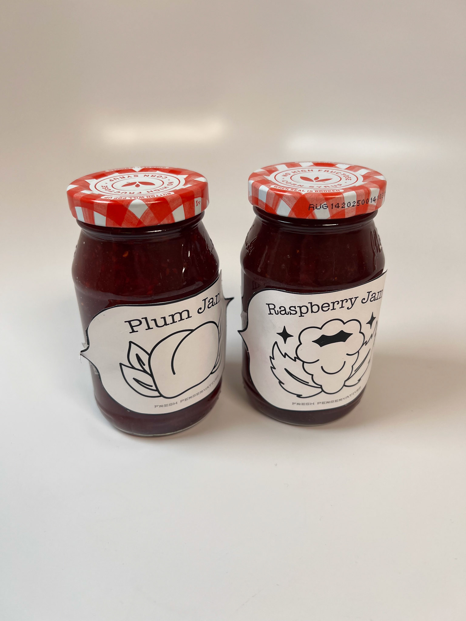
Early Prototype 1
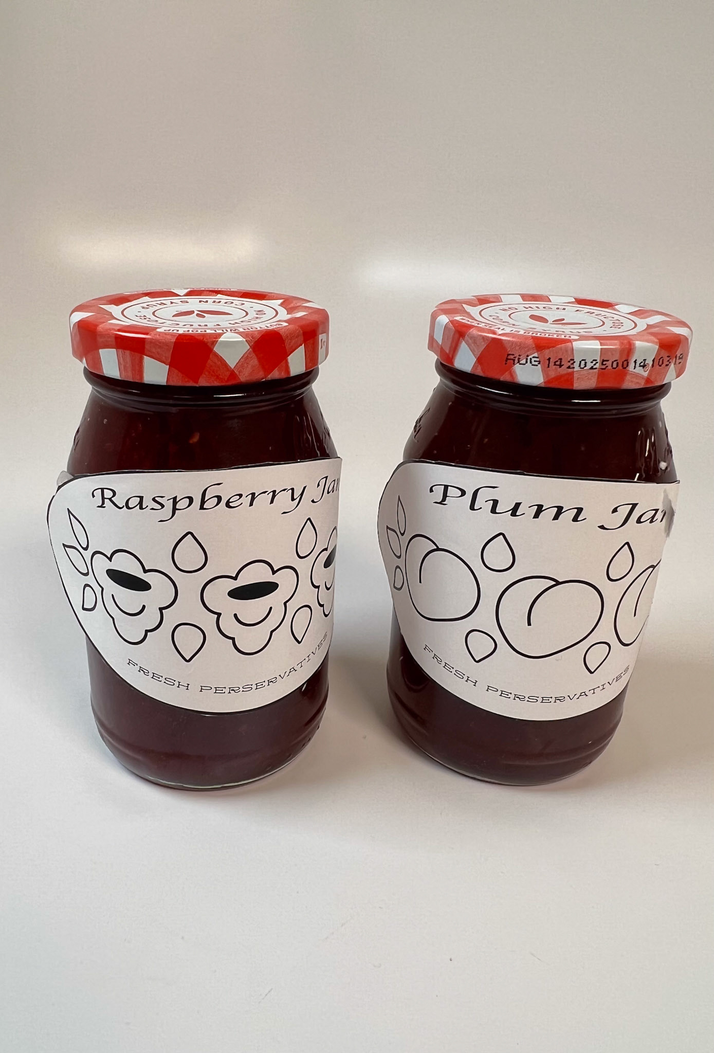
Prototype 2
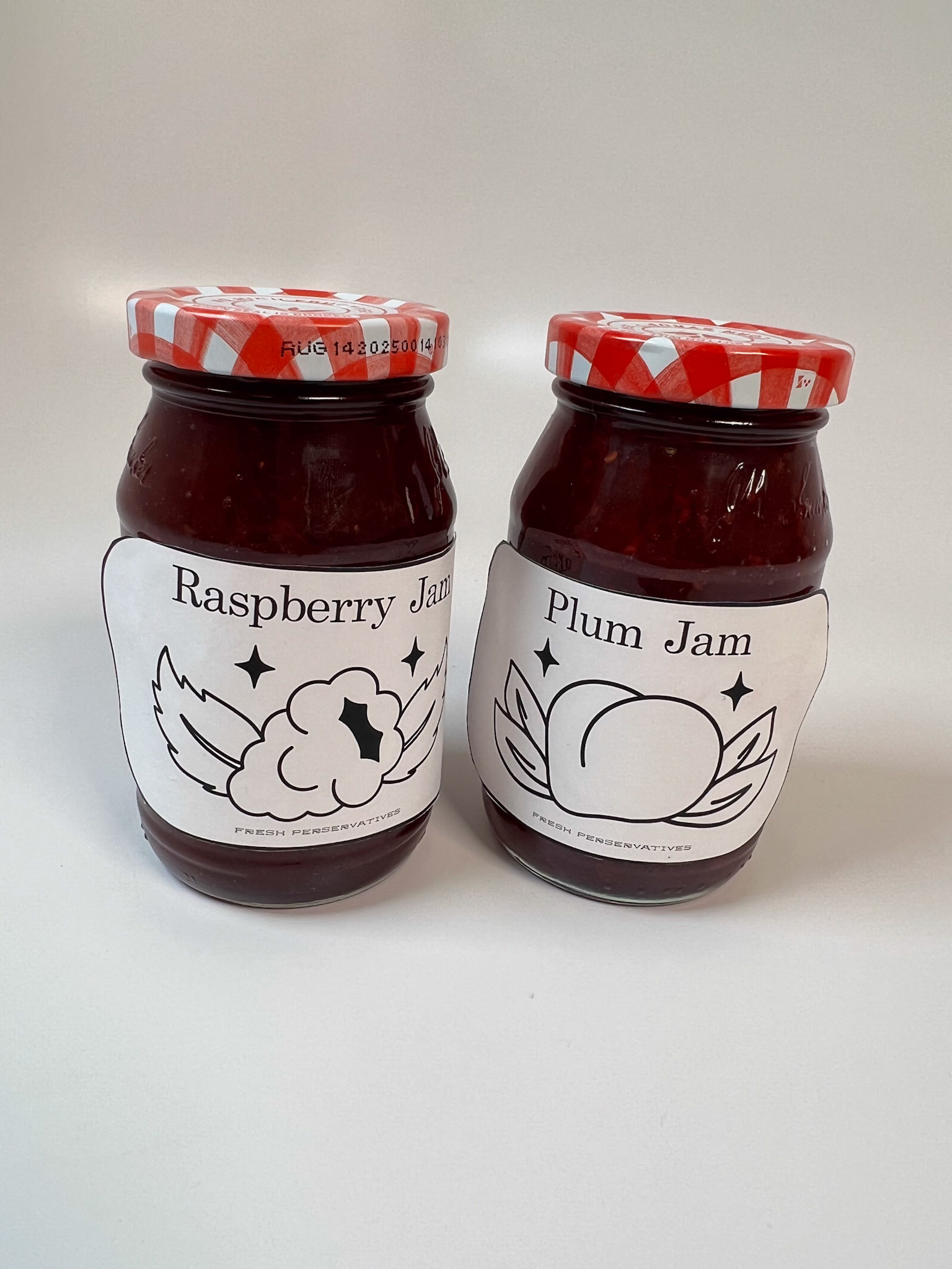
Prototype 3
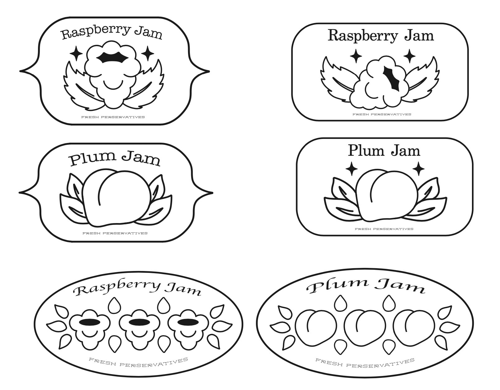
Early Framework Design
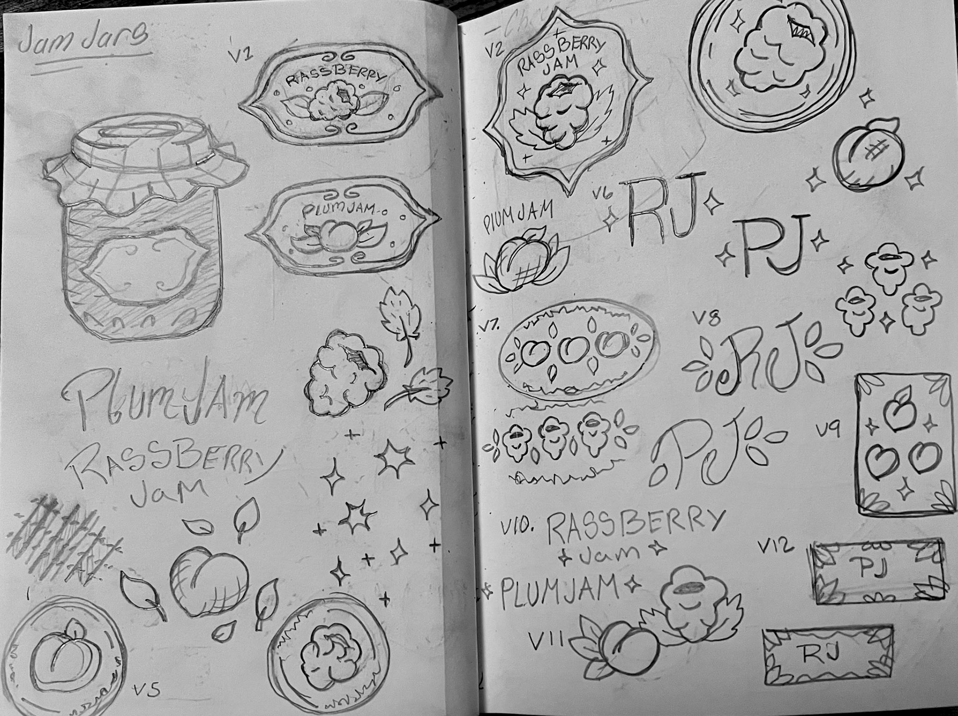
Concept Sketches
Lighthouse - Brie Cheese
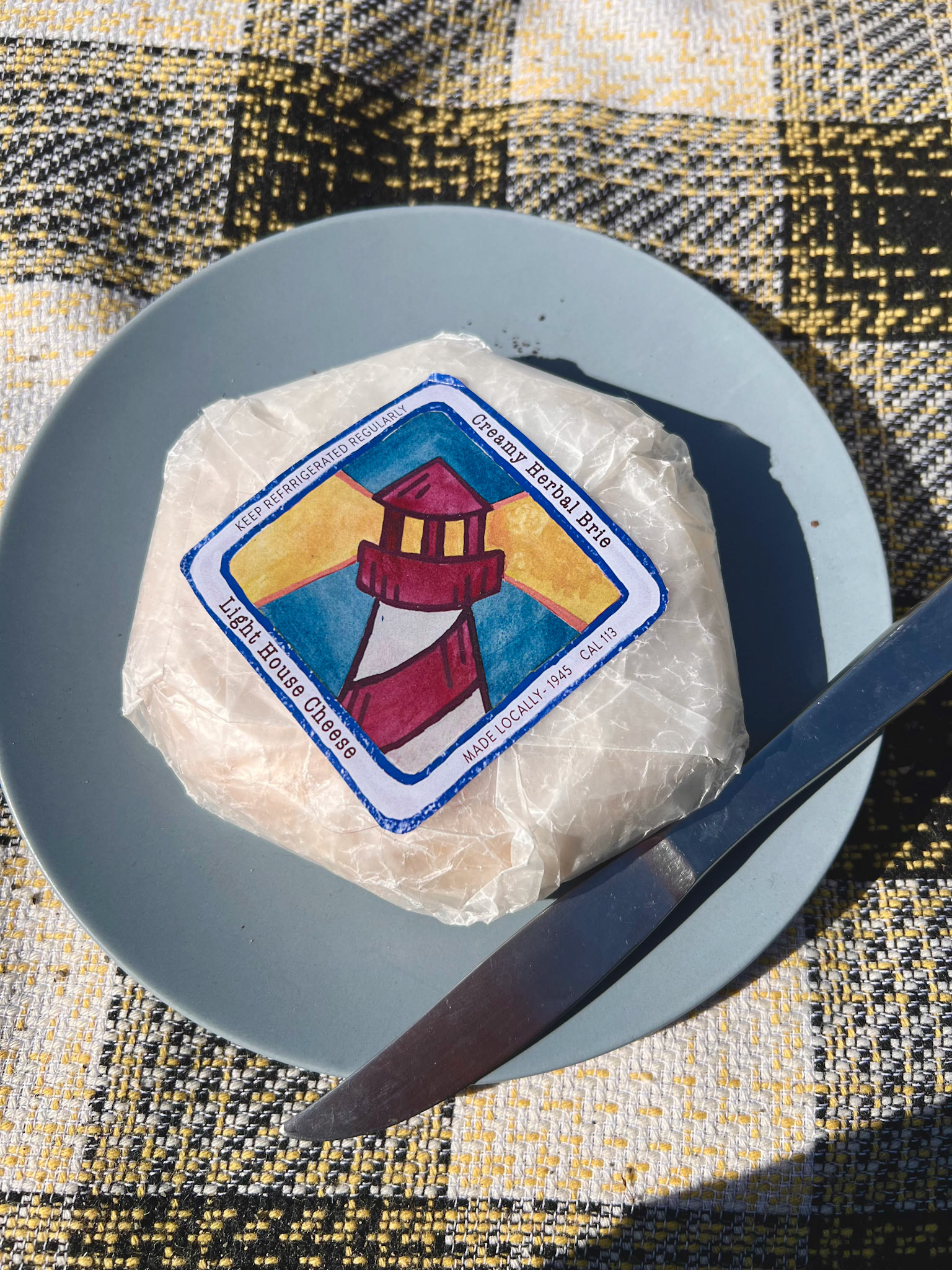
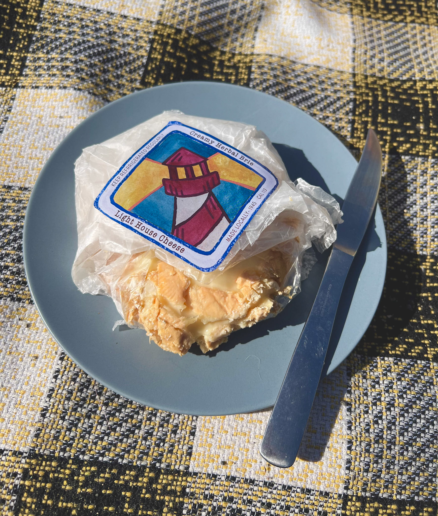
A good block of cheese is a must for any classic picnic. I knew I wanted to make this product when I had the idea for the cracker tin, and planned to make them a pair. The creation of the logo was similar to previous products. A Stamp boarder was created to frame a watercolor painting of the lighthouse. The physical logo was brought into the digital space where it was cleaned up and then highlighted by typography.
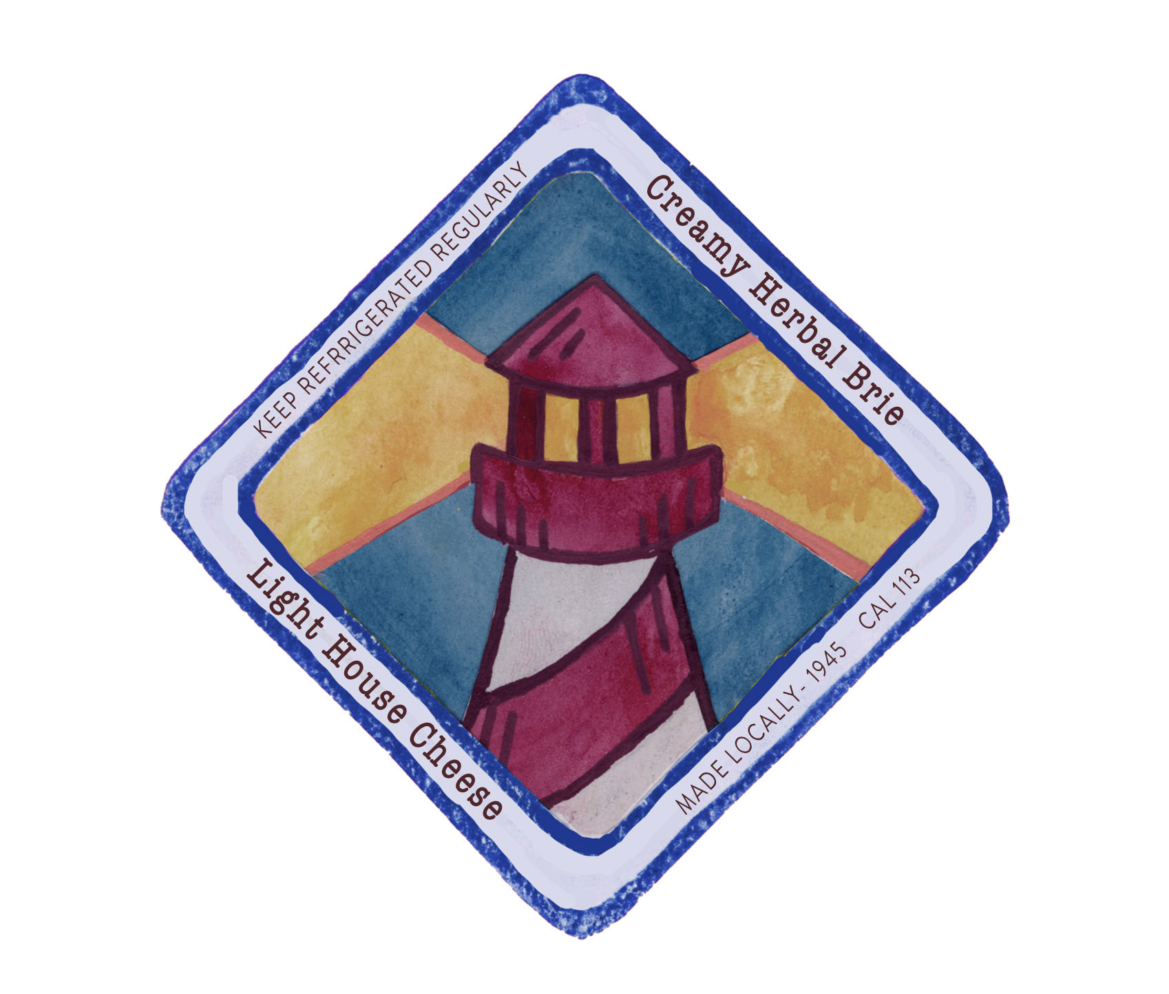
Final Logo
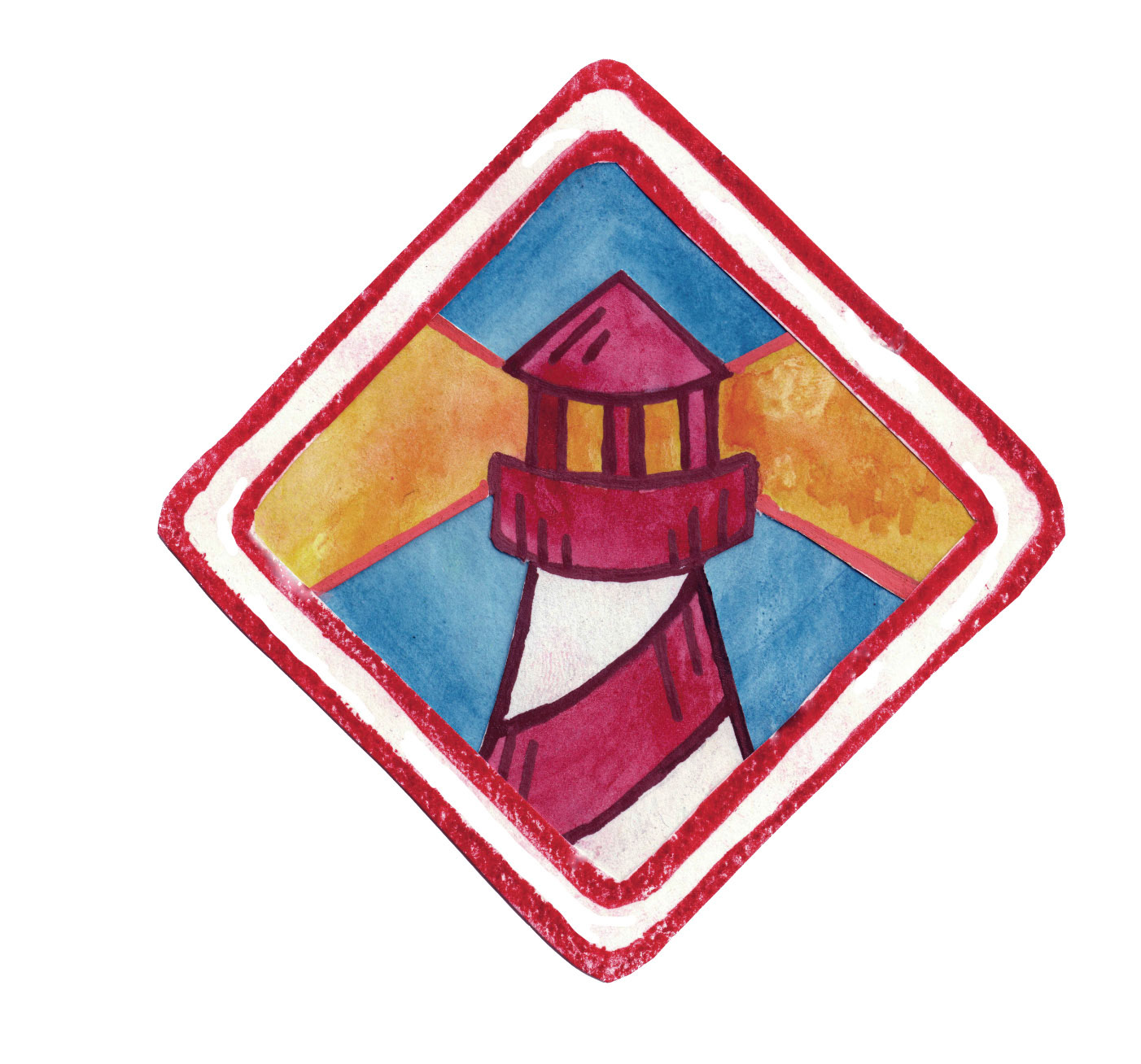
Original color test
Stamp Boarder Test
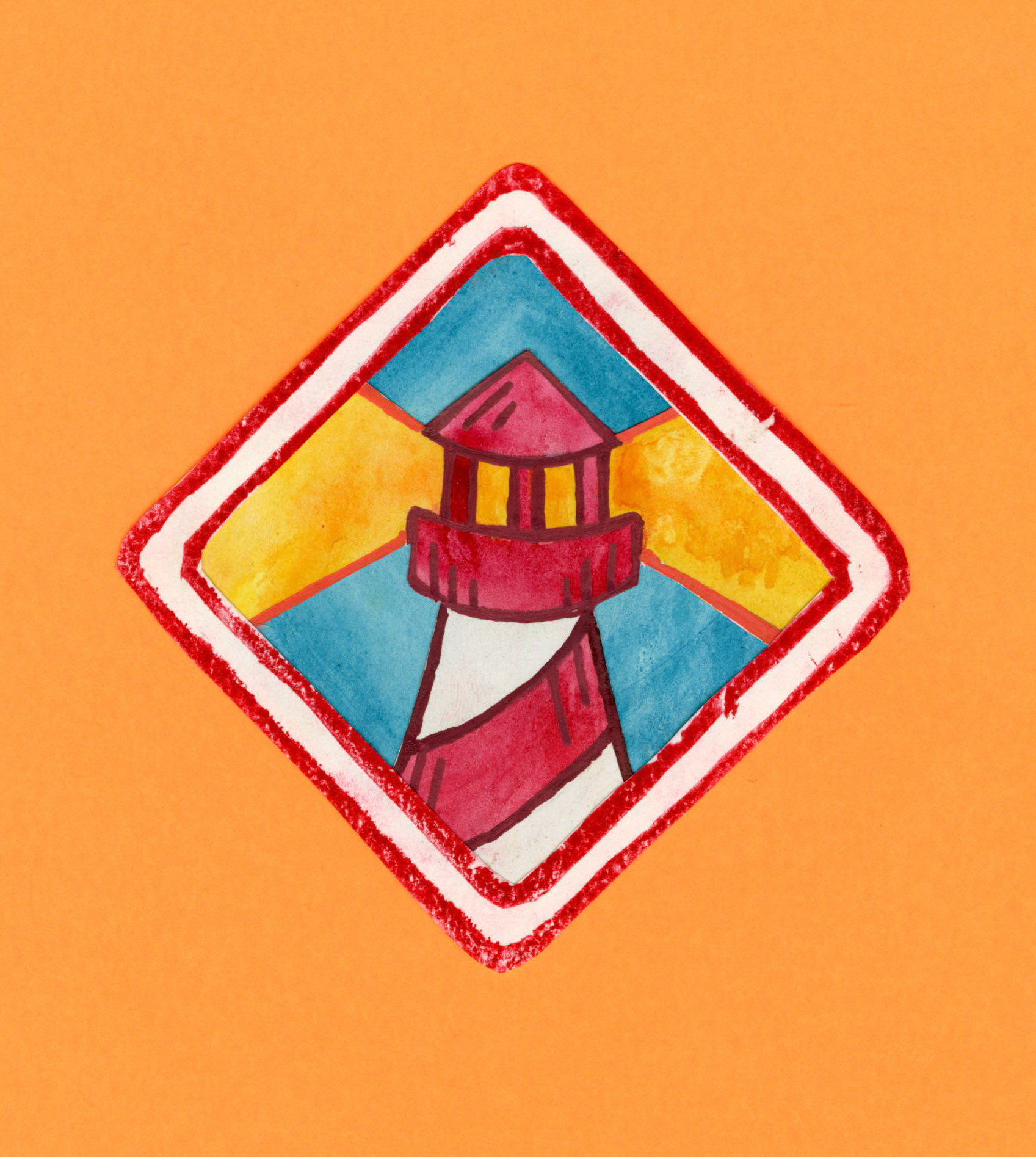
Watercolor Scan
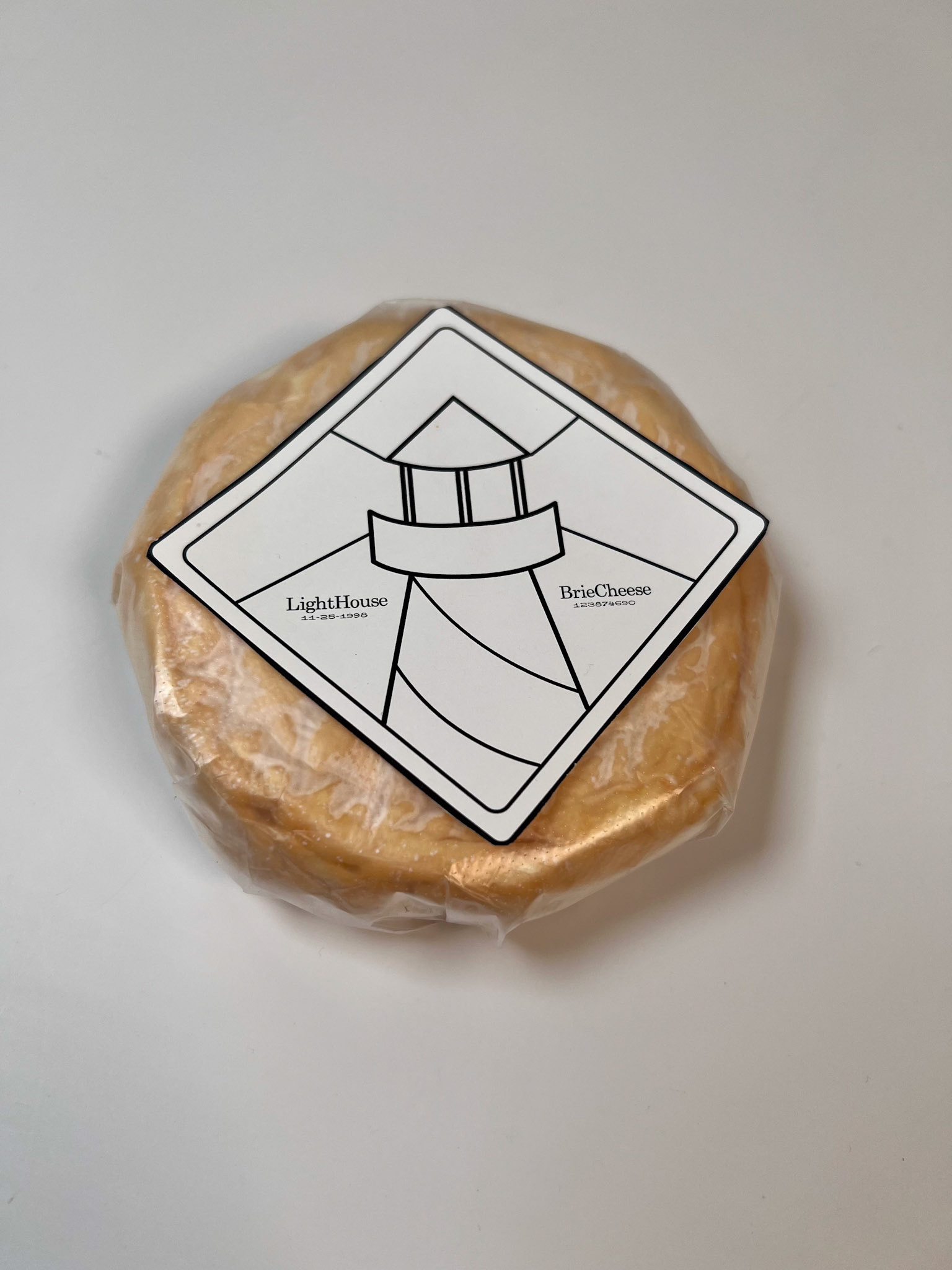
Early Prototype 1
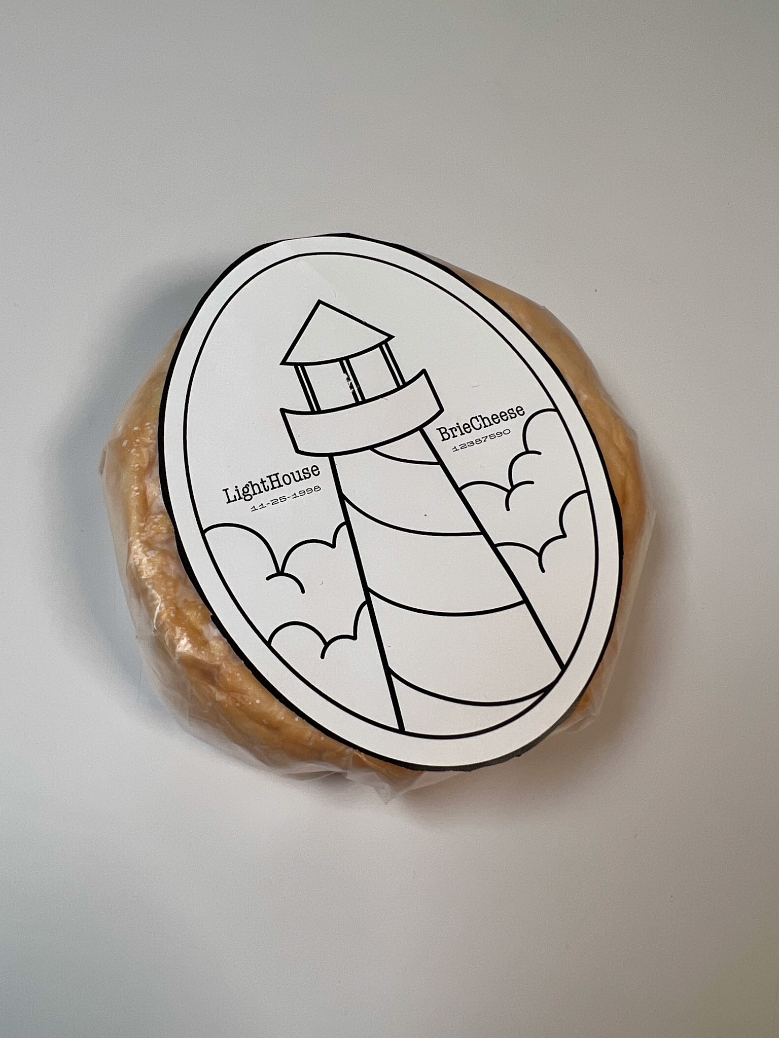
Prototype 2
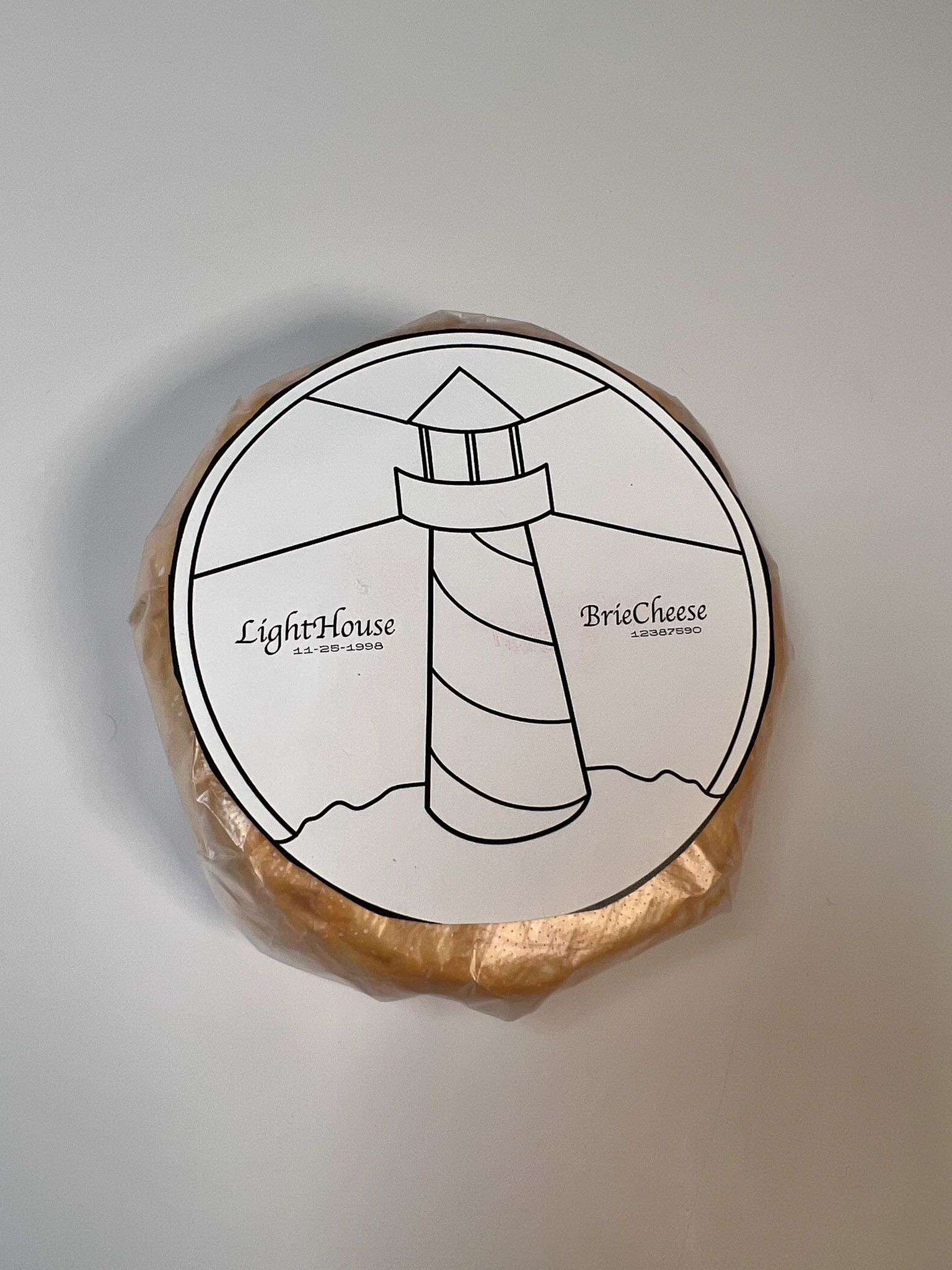
Prototype 3
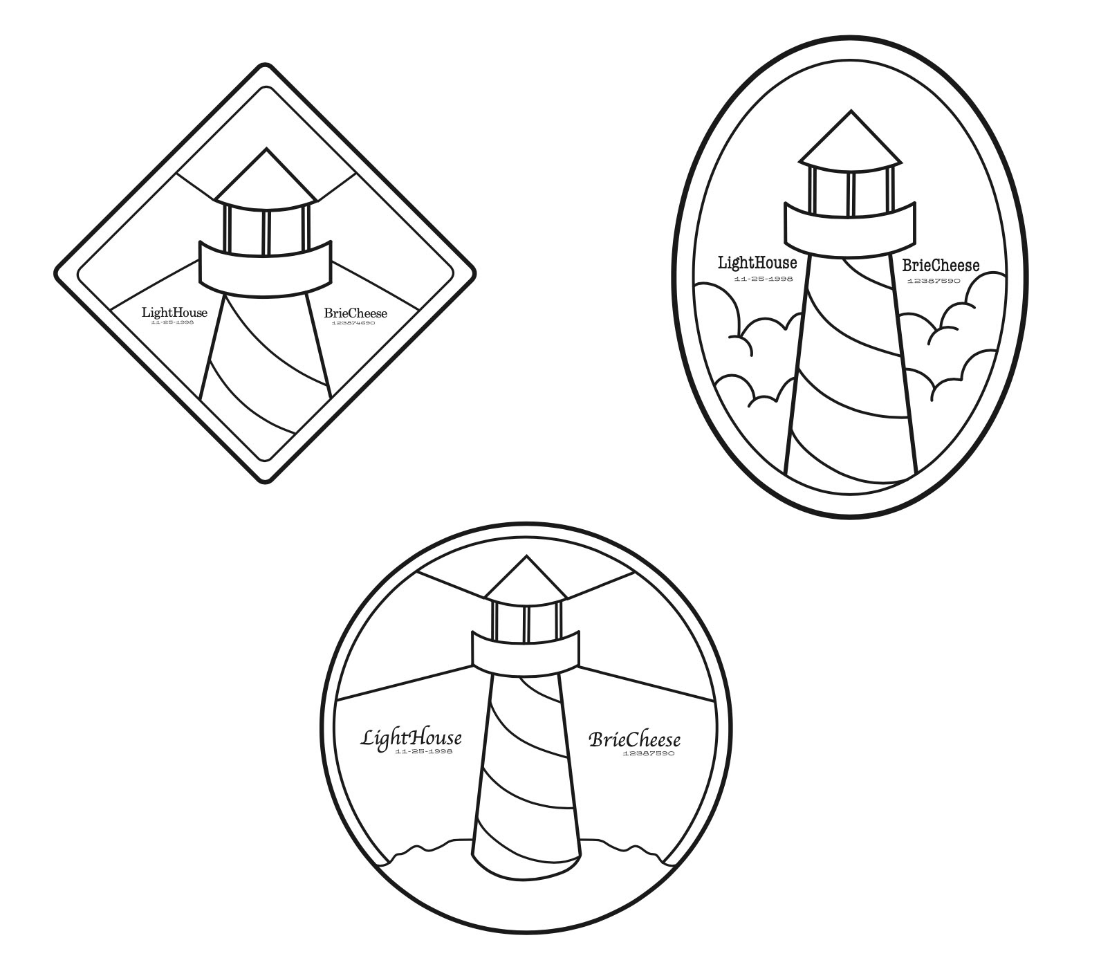
Early Framework Design
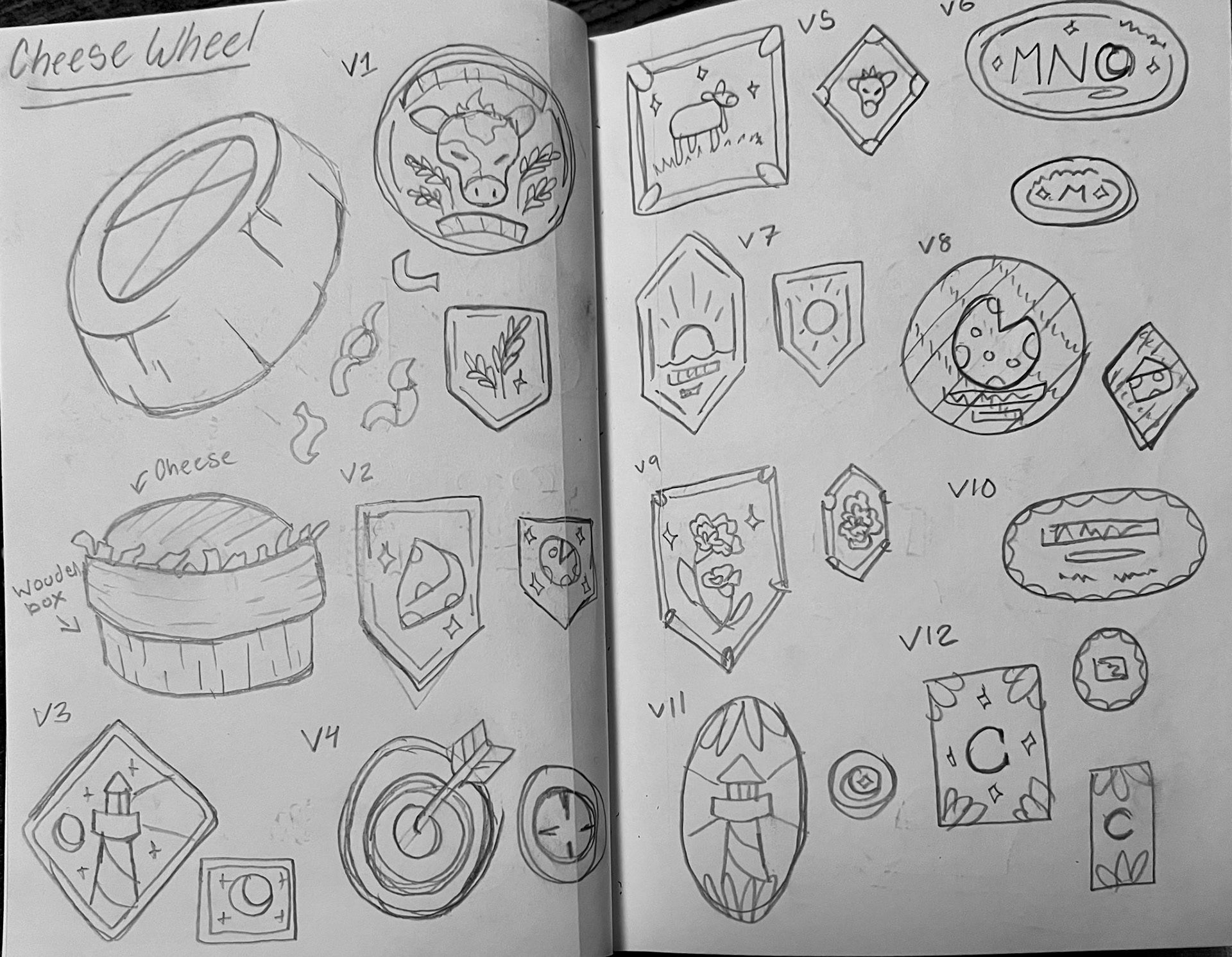
Concept Sketches
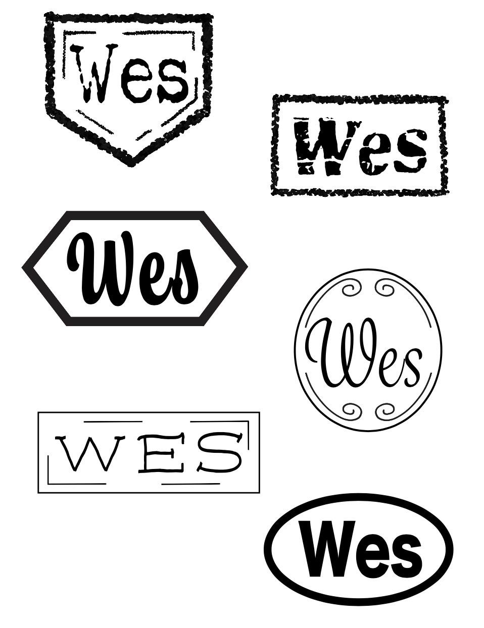
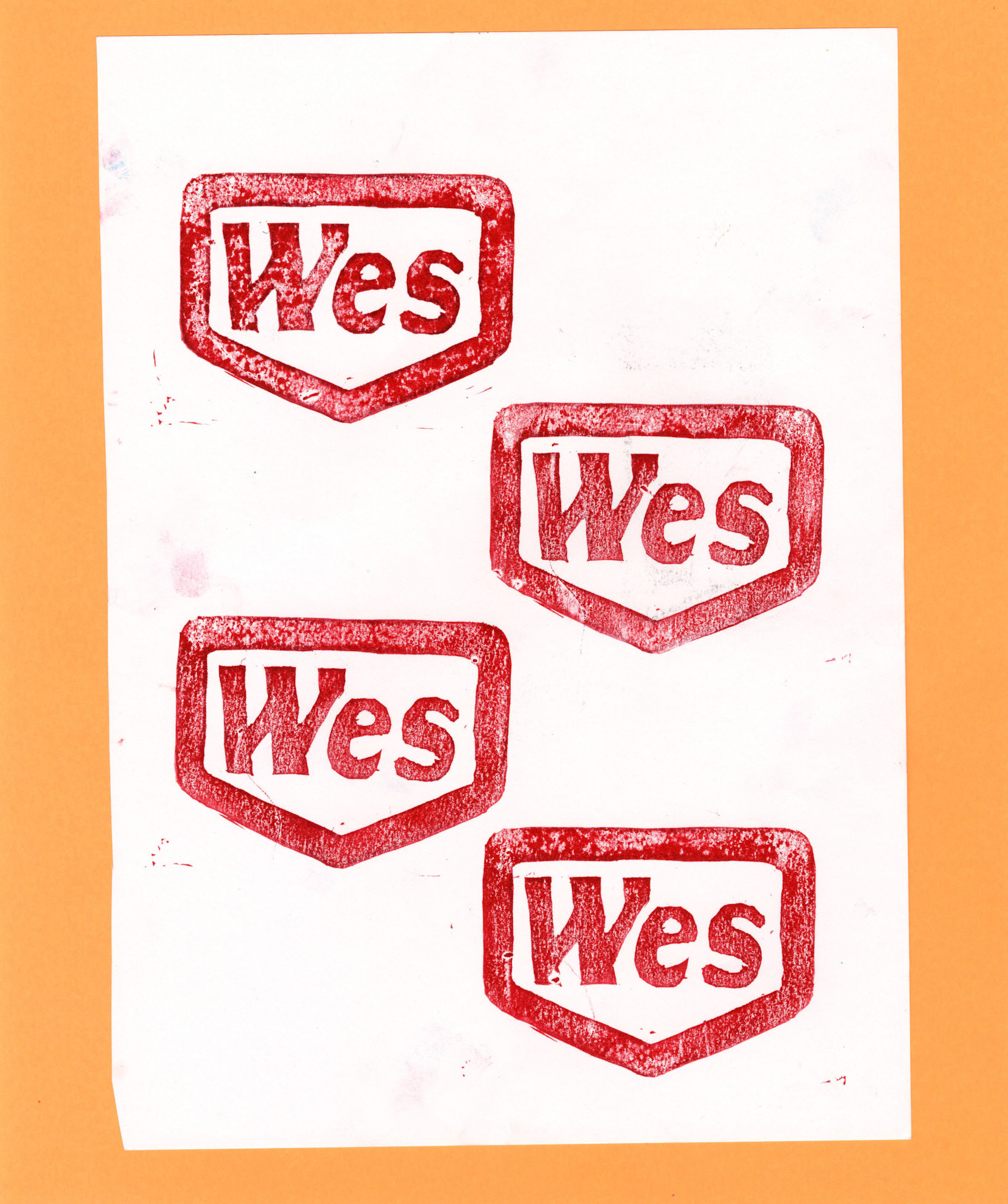
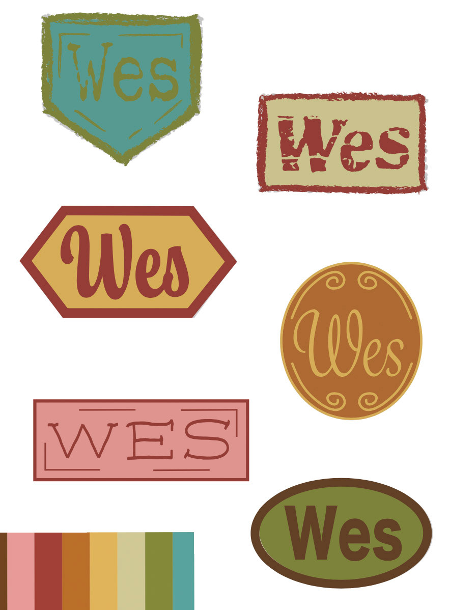
Wes Logo
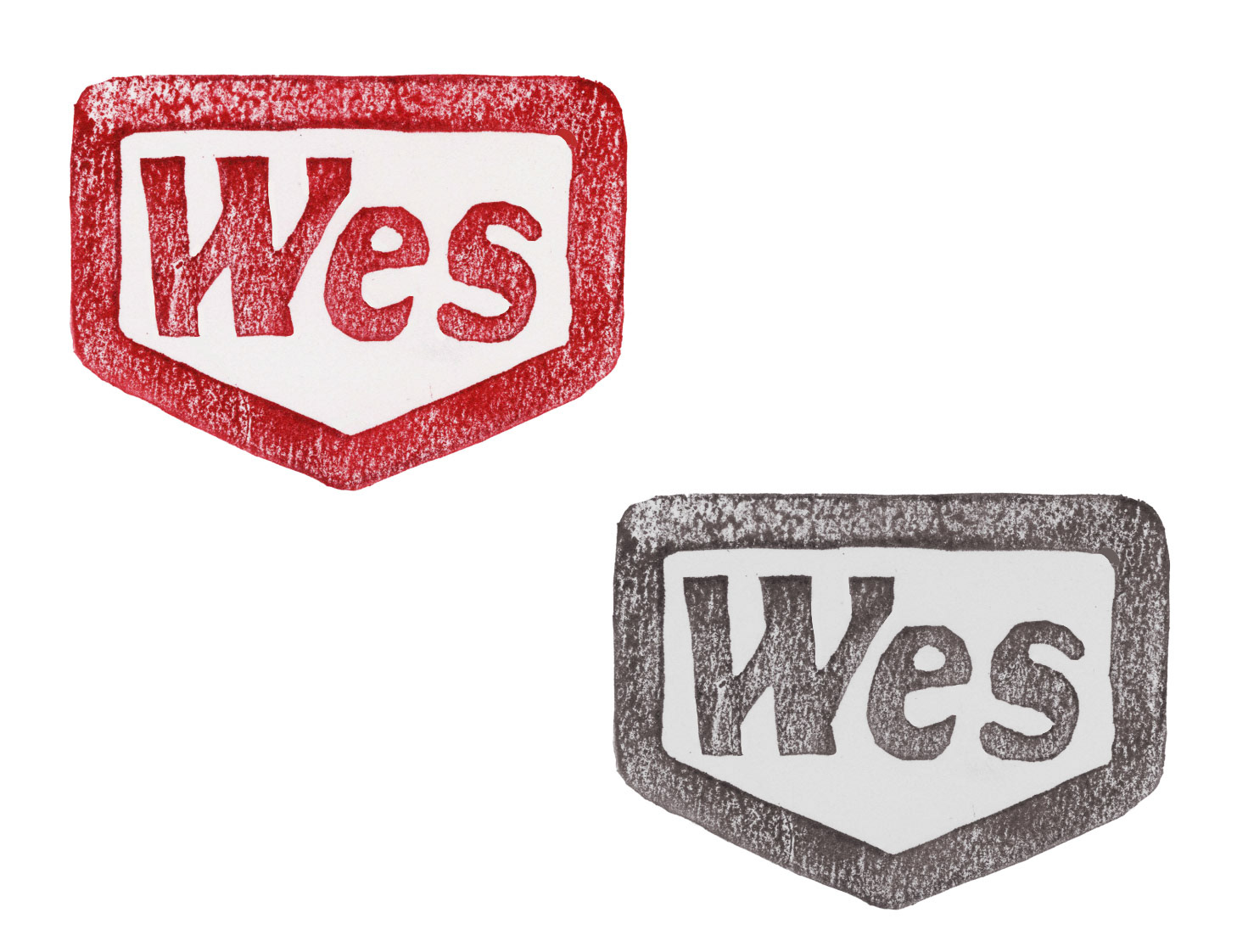
This was a small logo I added to all of my products, as a subtle way to unify the picnic set. As I was conceptualizing my products in this universe I had the idea that everything produced on Moonrise Kingdom's island would have a mark to show were it came from. This is were I came up with the concept of this Stamp. I went with the name Wes as a nod to the films director.
Size Test
Raw Scanned Stamps
Early Color Test
